In 2003 I received a phone call- an offer from Pan Macmillan to publish a four book series of my Seadog stories. I set up a painting desk in our kitchen, and in between the bustle of a husband and three busy school age children as well as part time teaching, I embarked on the writing and illustrating of the first two books. With around 65 illustrations in each as well as the artwork for covers, endpapers and incidentals, it was a huge undertaking. Funnily enough, having less time drove my efficiency. I also designed the look of the series. I wanted the books to have the feel of old fashioned adventure stories, and I researched different layouts from the 1940s- the 1960s, choosing the illustration spreads and fonts to reflect this. Pan Macmillan was incredibly generous, not only to support a hard-backed, dusk jacketed full colour format, but to allow me to instruct the designer on every point.
The cover art for the first book in the Seadog Adventures series- 'Left Shoe and the Foundling'
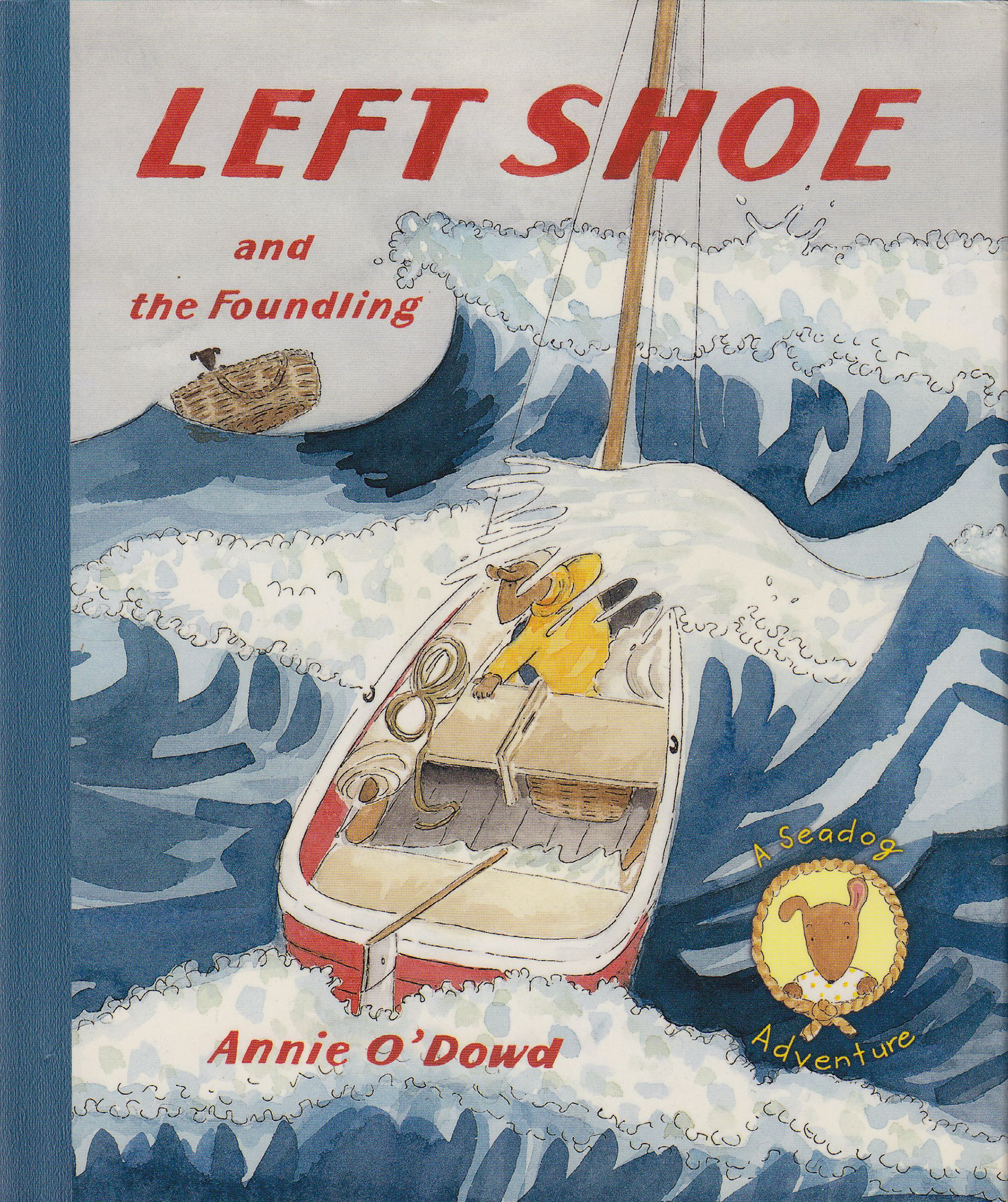
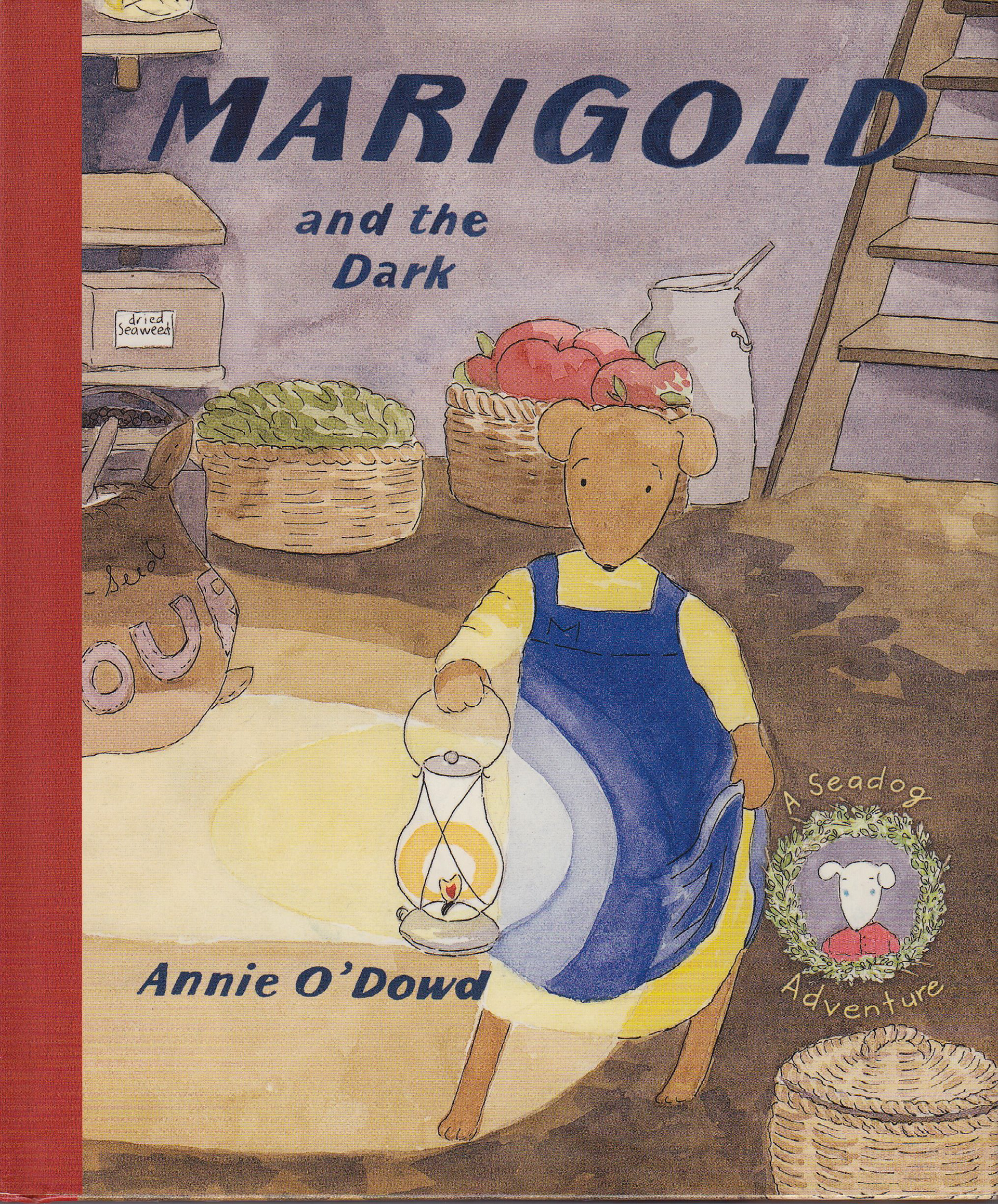
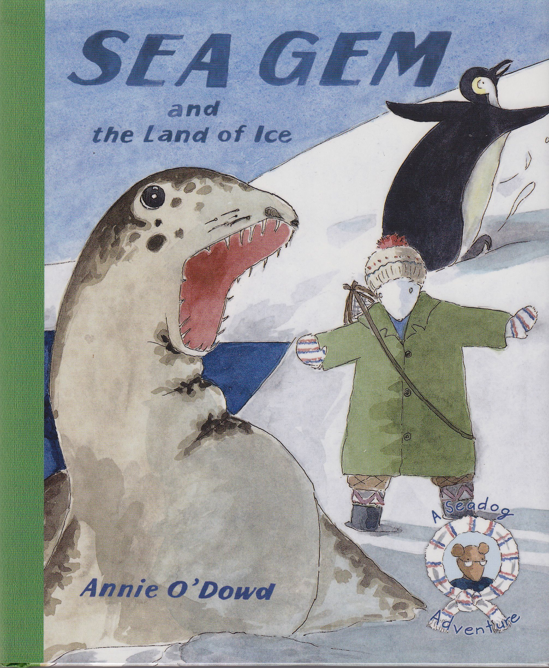
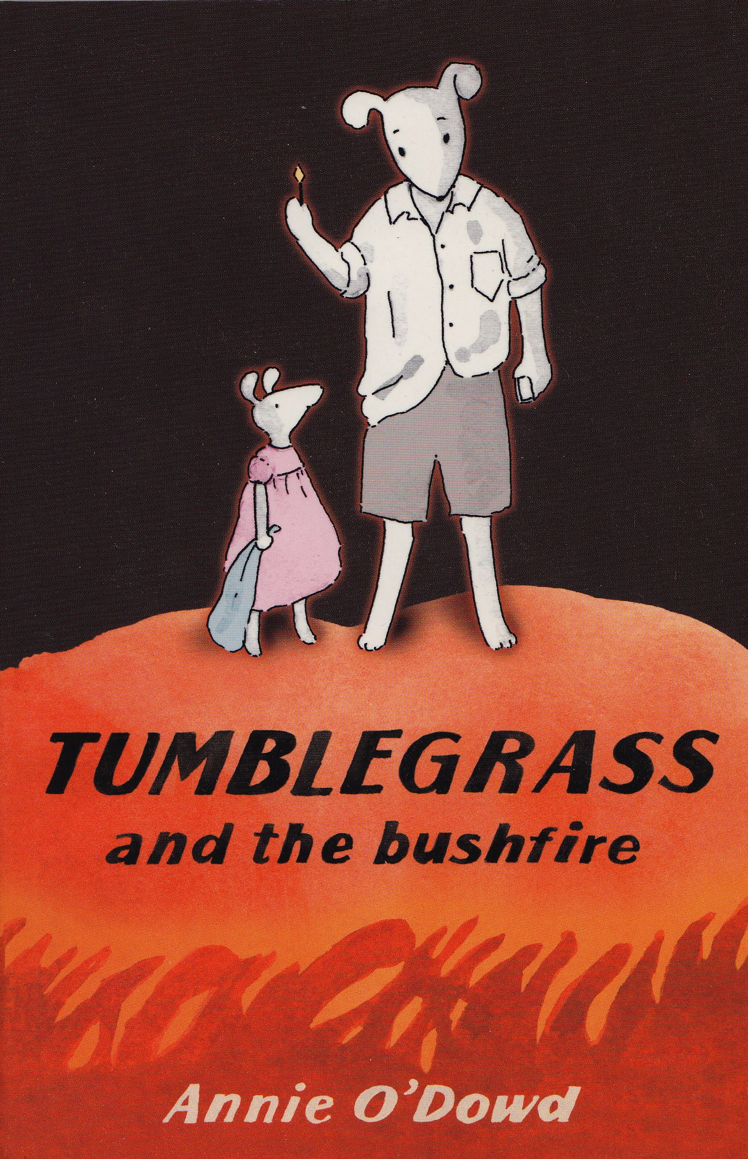
The final covers of the four books in the Seadog series
The initial cover and book design for Left shoe was a process of trail and error. My first attempts seemed hopelessly uninteresting. Then I decided the cover needed to reflect a dramatic moment in the story. You can see my first colour cover rough which felt right depicted a stormy sea with Left Shoe about to meet the foundling. The colour of the sea was greenish but that was thought to have less appeal than a blue sea. so I changed it (a little reluctantly) to suit the brief. I also had to think about the style of font I wanted for the titles as we;;. I made a scrap book of different designs from old fashioned children's books. One style of title caught my eye- in the story called 'The Red Strange'. I searched for a font similar to this and then the designer at Pan slanted to letters to create a feeling of action. All the titles were traced and hand painted.
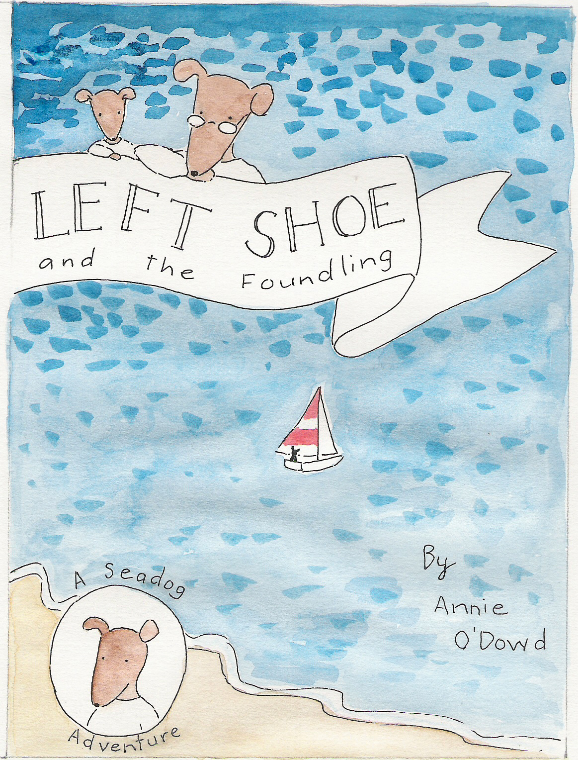
An early rough- too dull!
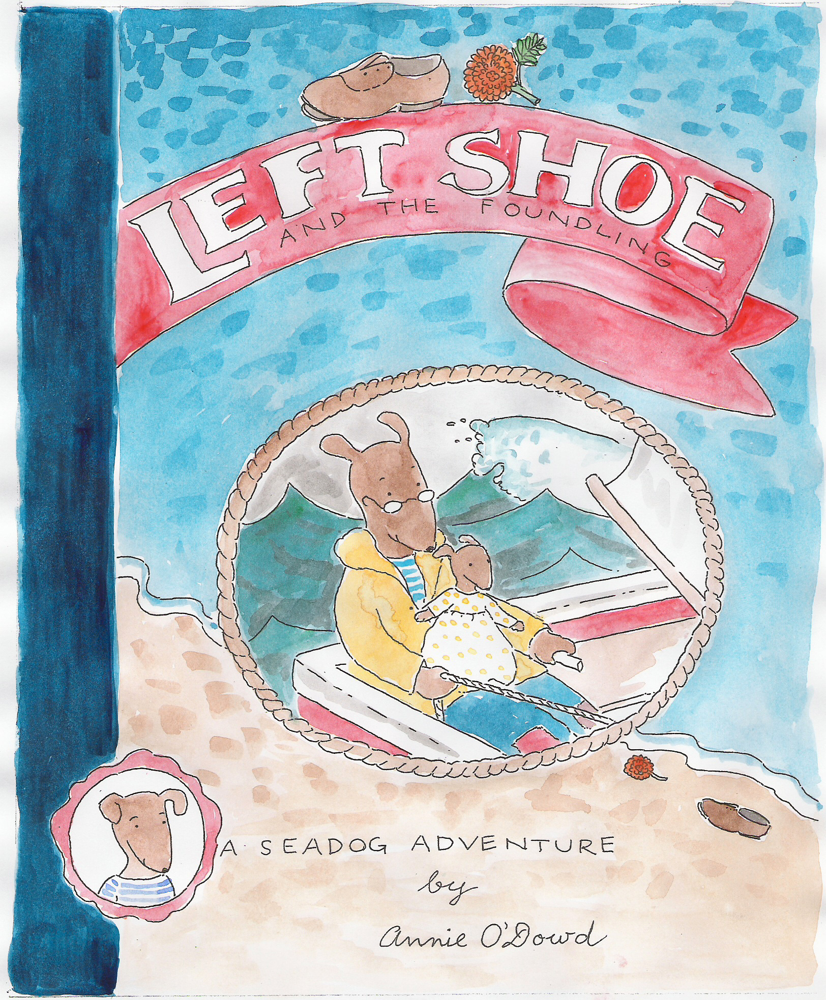
A second version- still not right
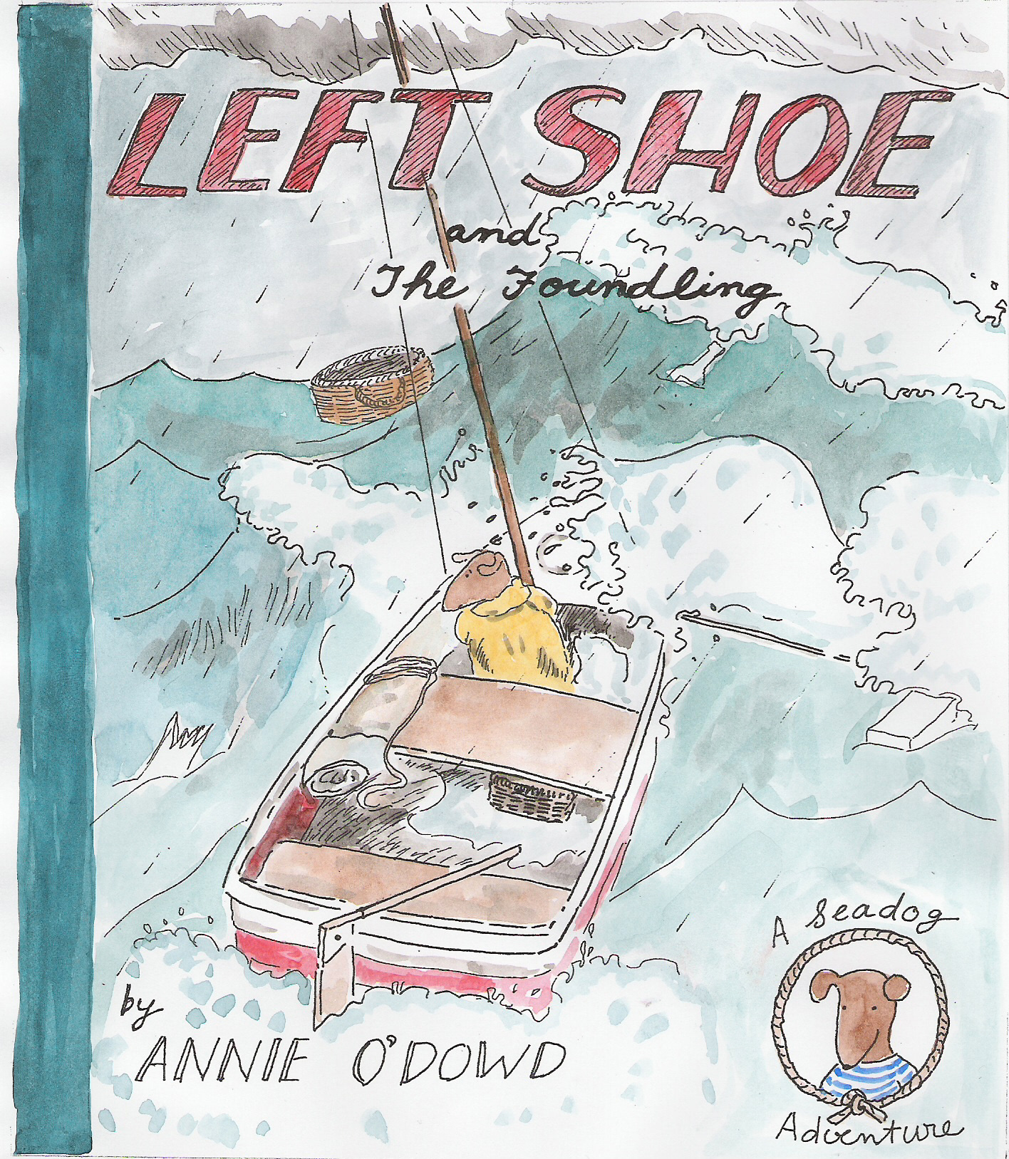
The colour rough for the final design

The final painted title- still with a 'handmade feel'

The font style I tried to emulate
Printed titled for me to trace and paint
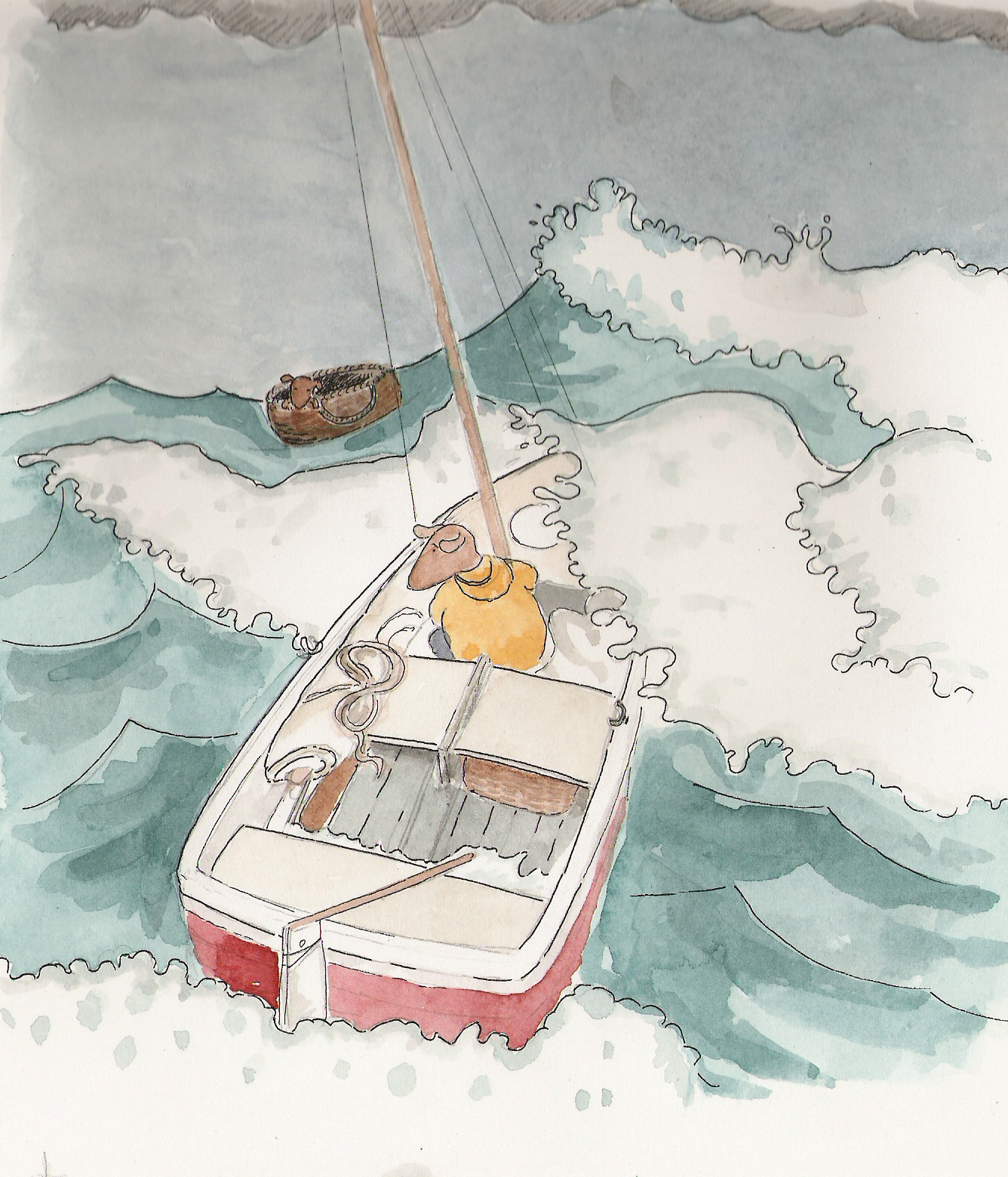
The first version of the colour rough
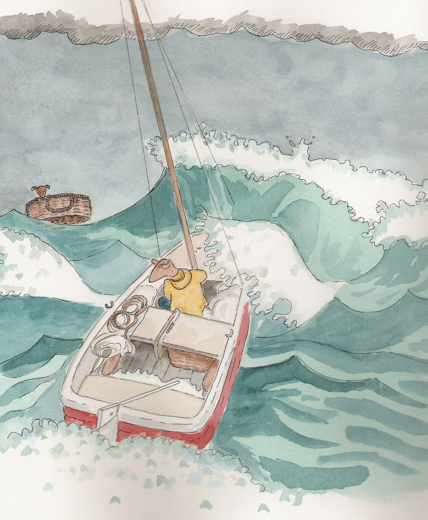
A change in position to make the foundling seem in greater danger
The book covers from the series. The change in format for the fourth book was a publishers decision to try to reach a different market. A 'b-format' paper back with black and white illustrations presented another artistic challenge. I had to learn 'grey scale', creating the watercoloured illustrations using only gradations of palest grey to opaque black.
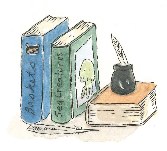
Seadogs love to read books
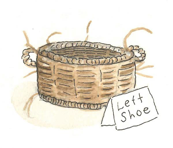
A seagrass sleeping basket for seadog pups
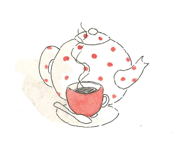
Seadogs love squink (squid ink tea)
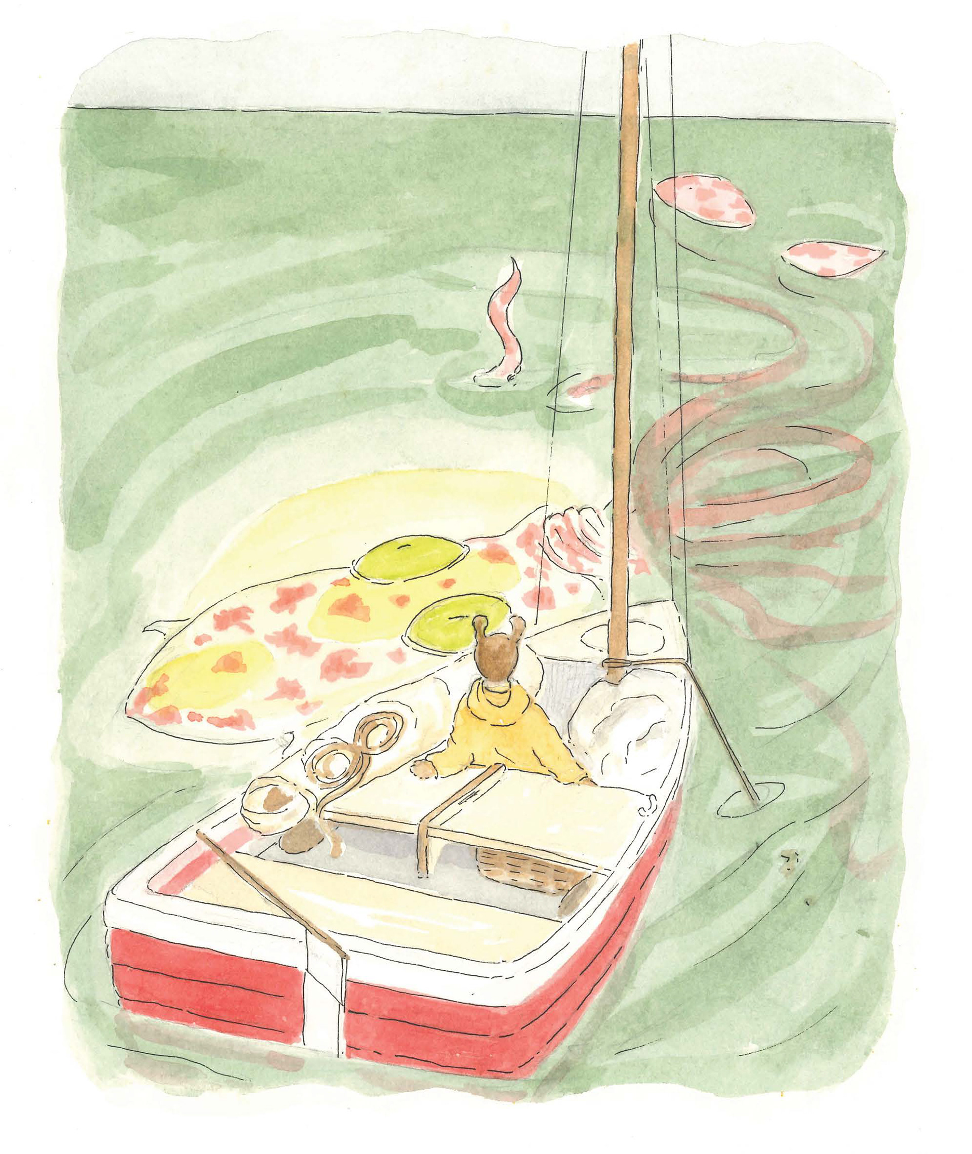
Left Shoe meets the dreaded giant squid!
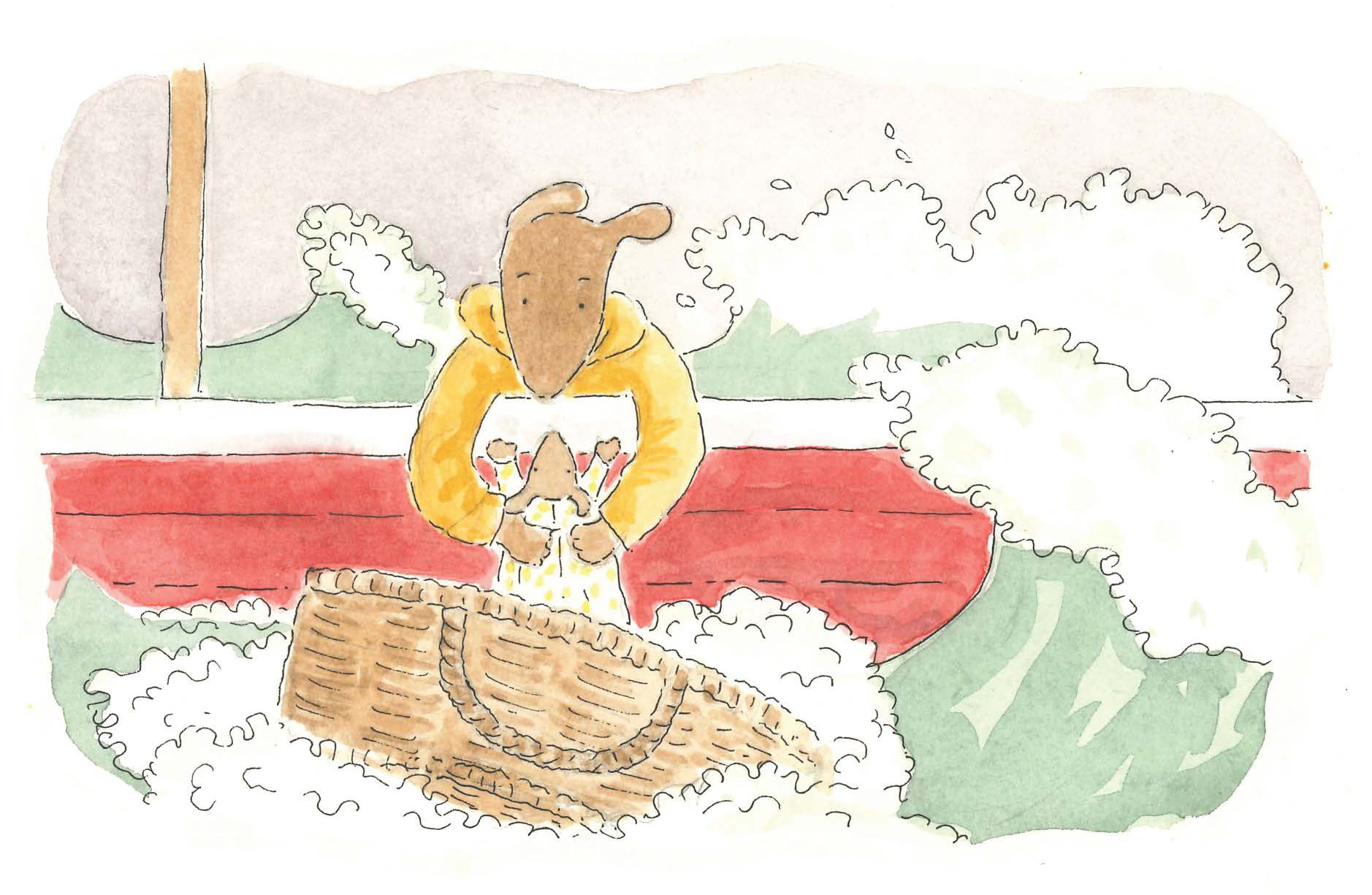
The rescue of the foundling
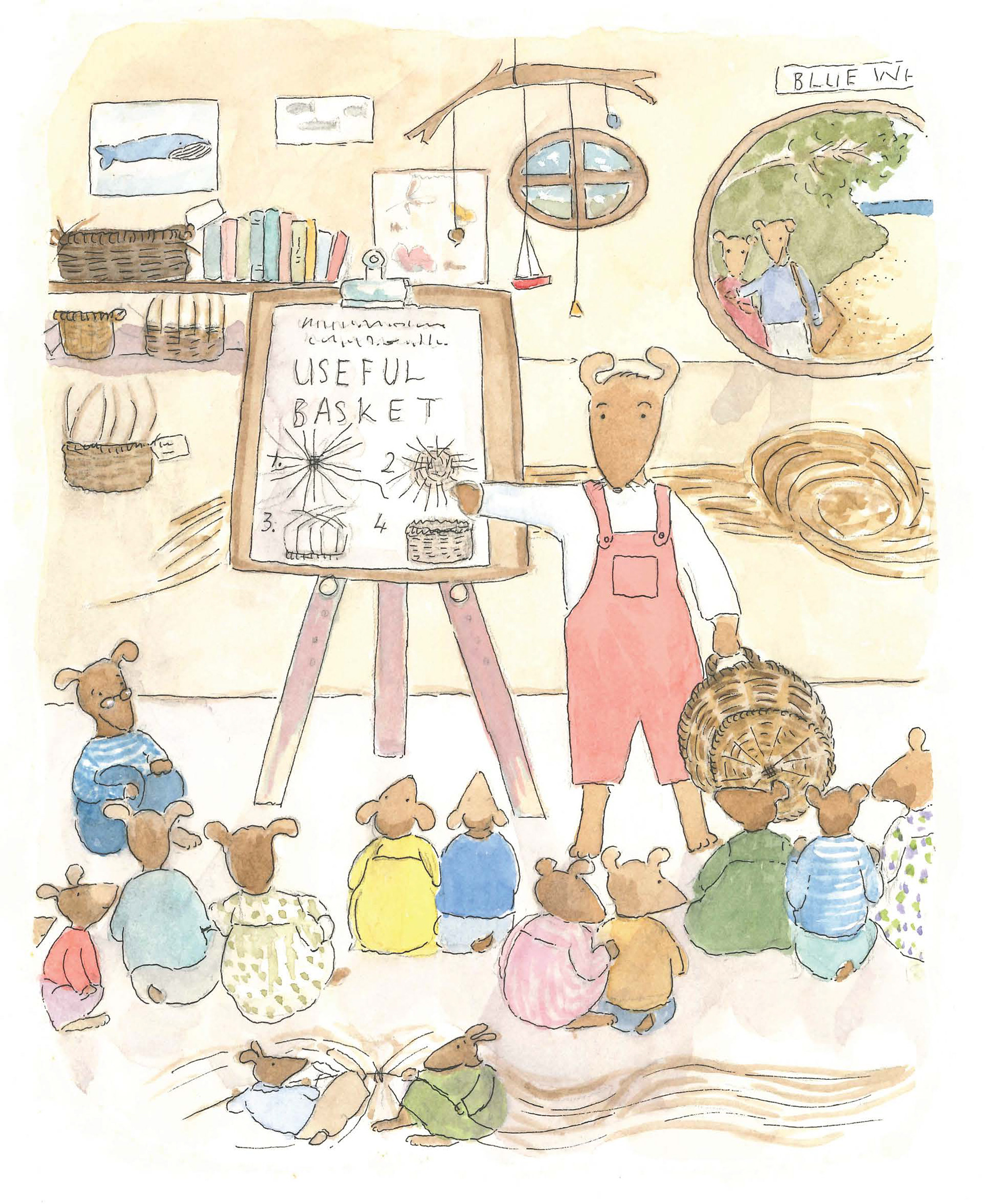
Left Shoe goes to school
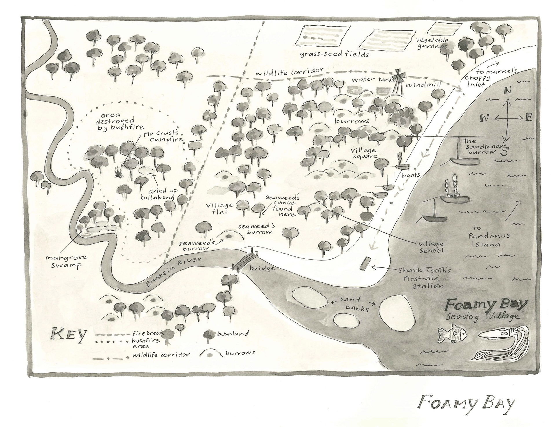
A map of Foamy Bay
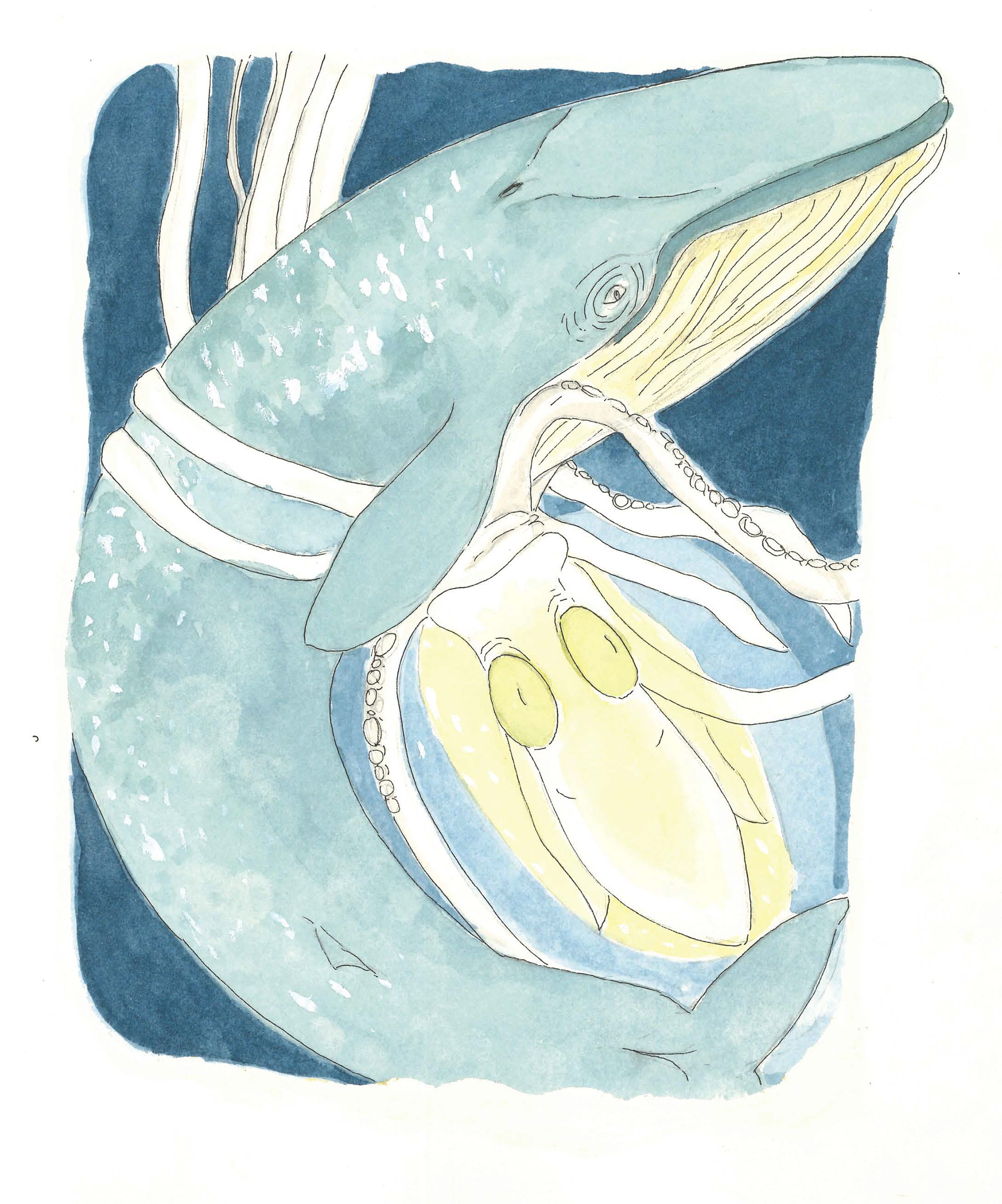
The Great Blue Whale saves the day
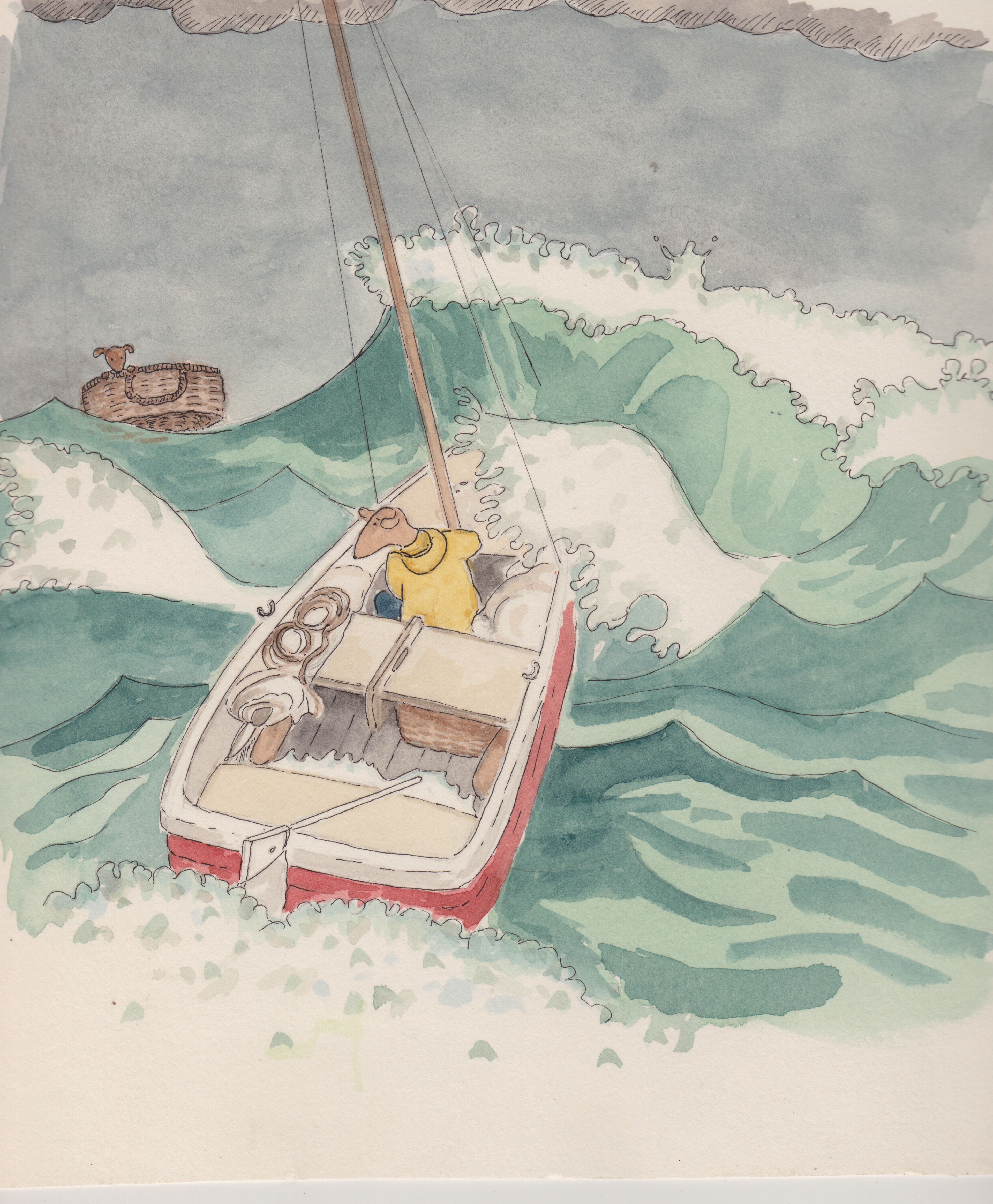
The first cover artwork showing a green sea
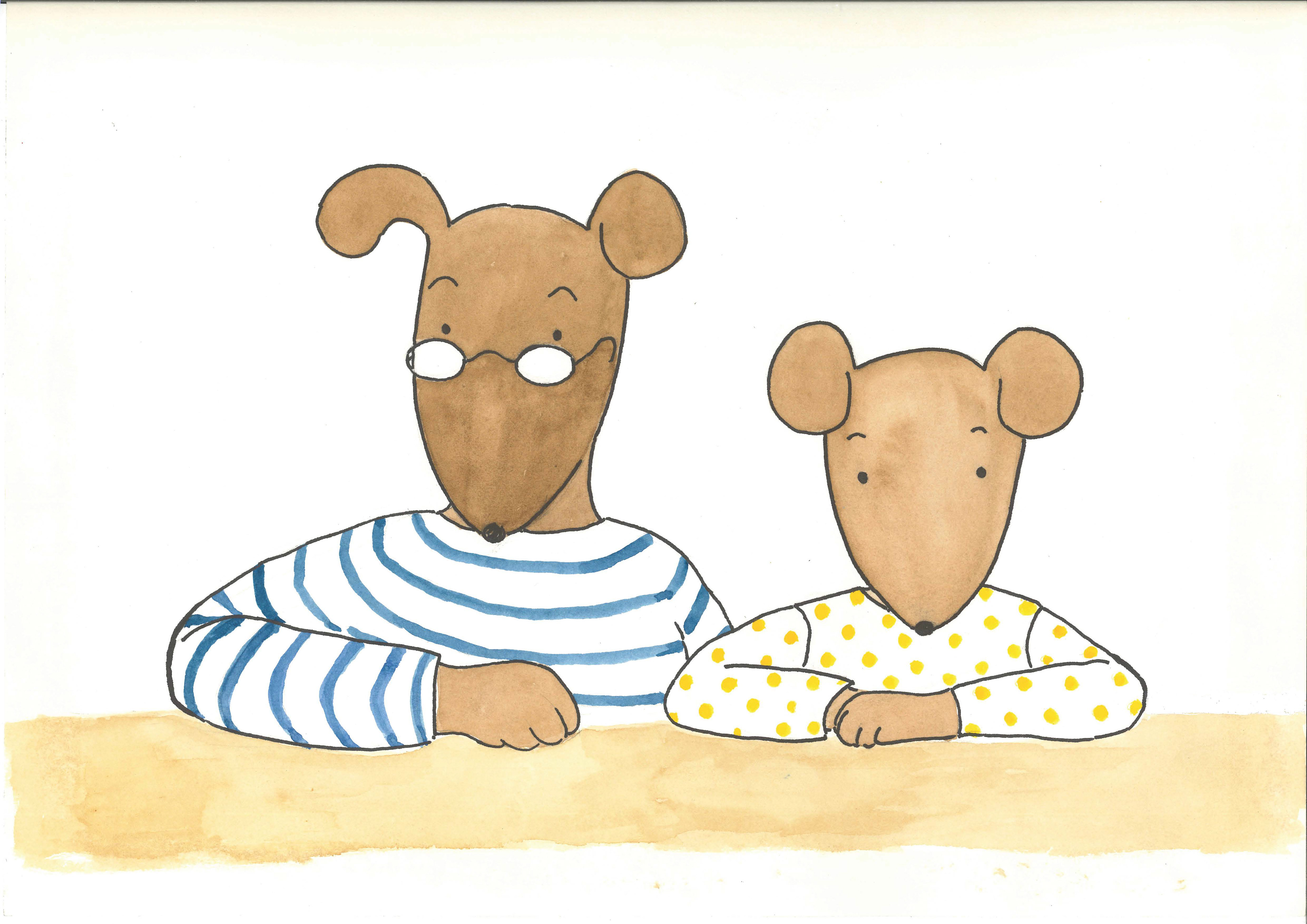
Left Shoe and Marigold
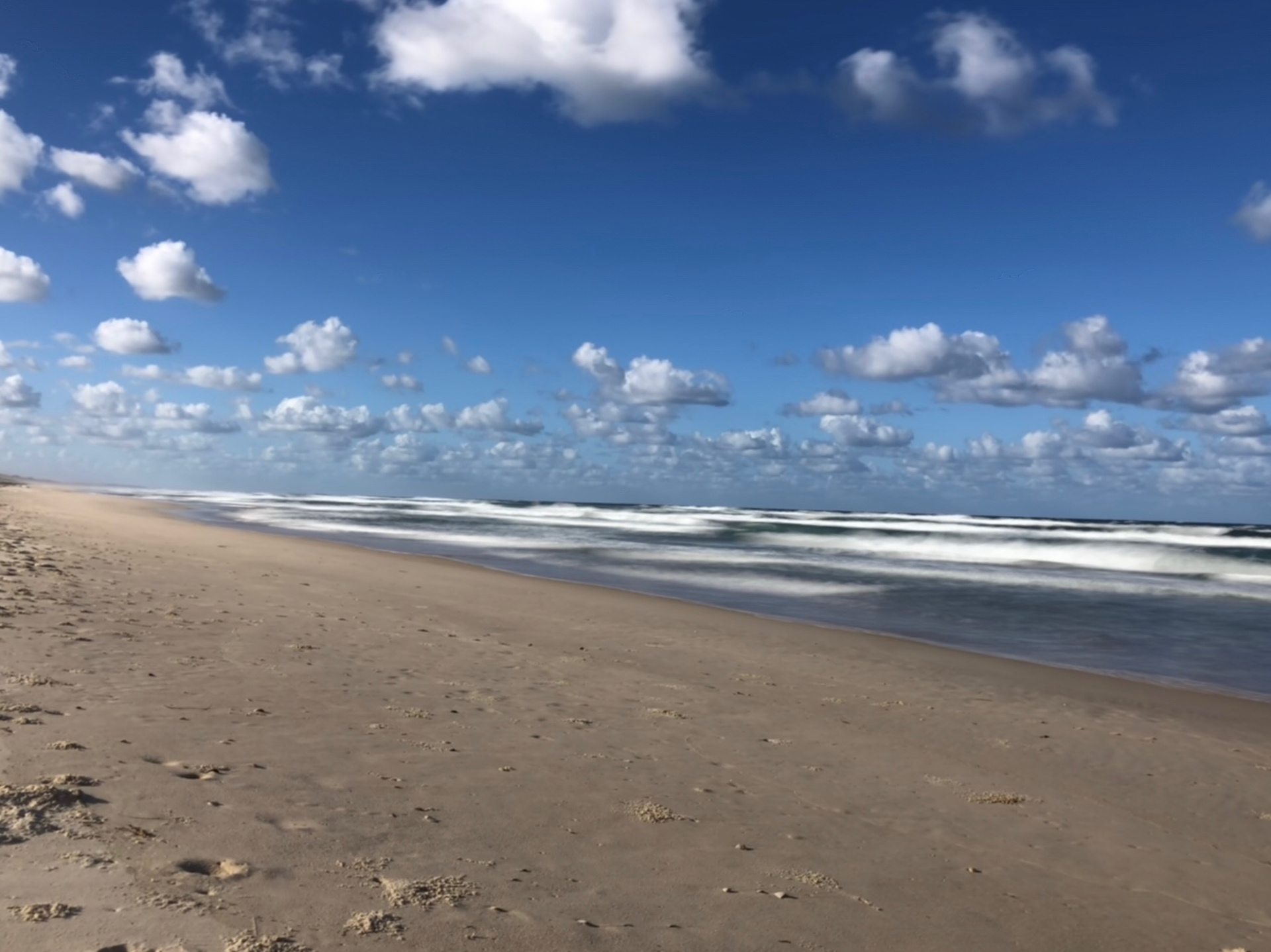
The place of inspiration for the seadogs
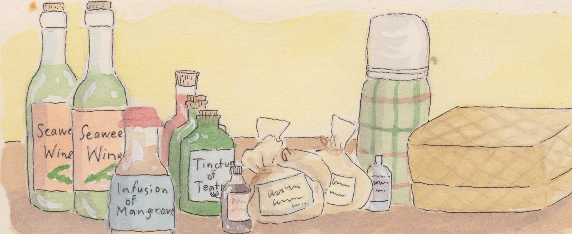
The shopping from 'Marigold and the Dark'
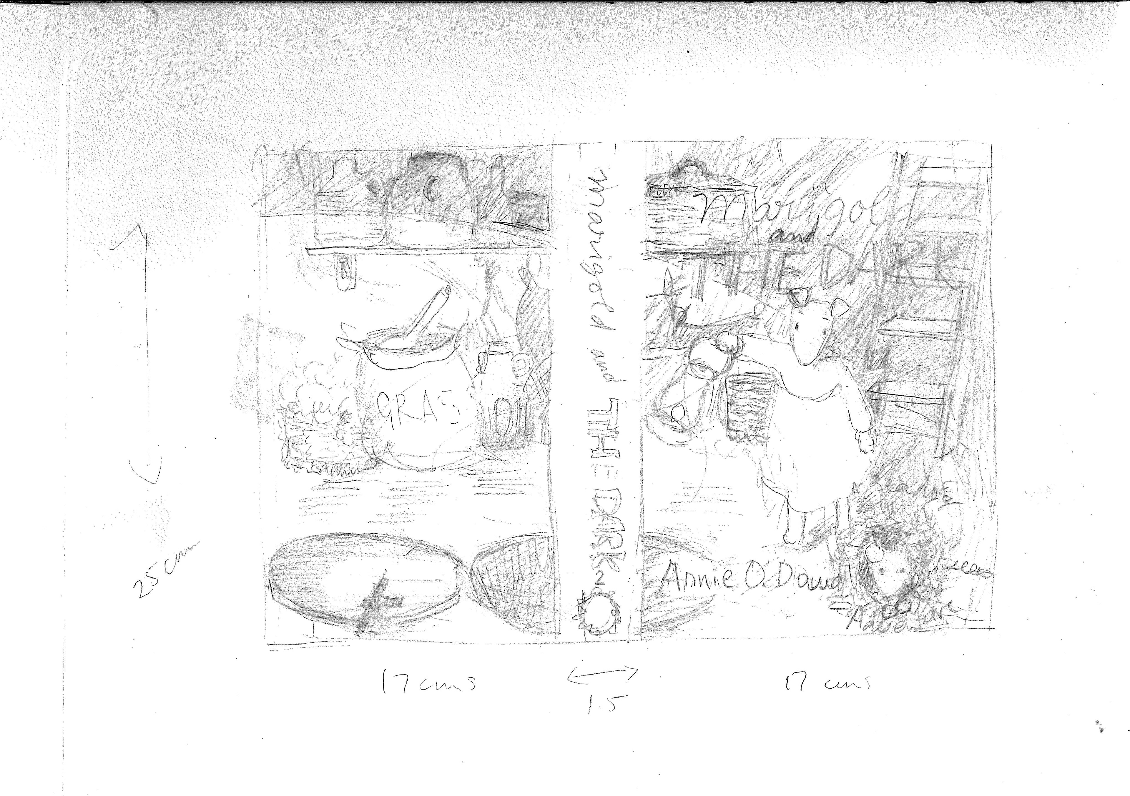
The pencil rough for the 'Marigold and the Dark' cover
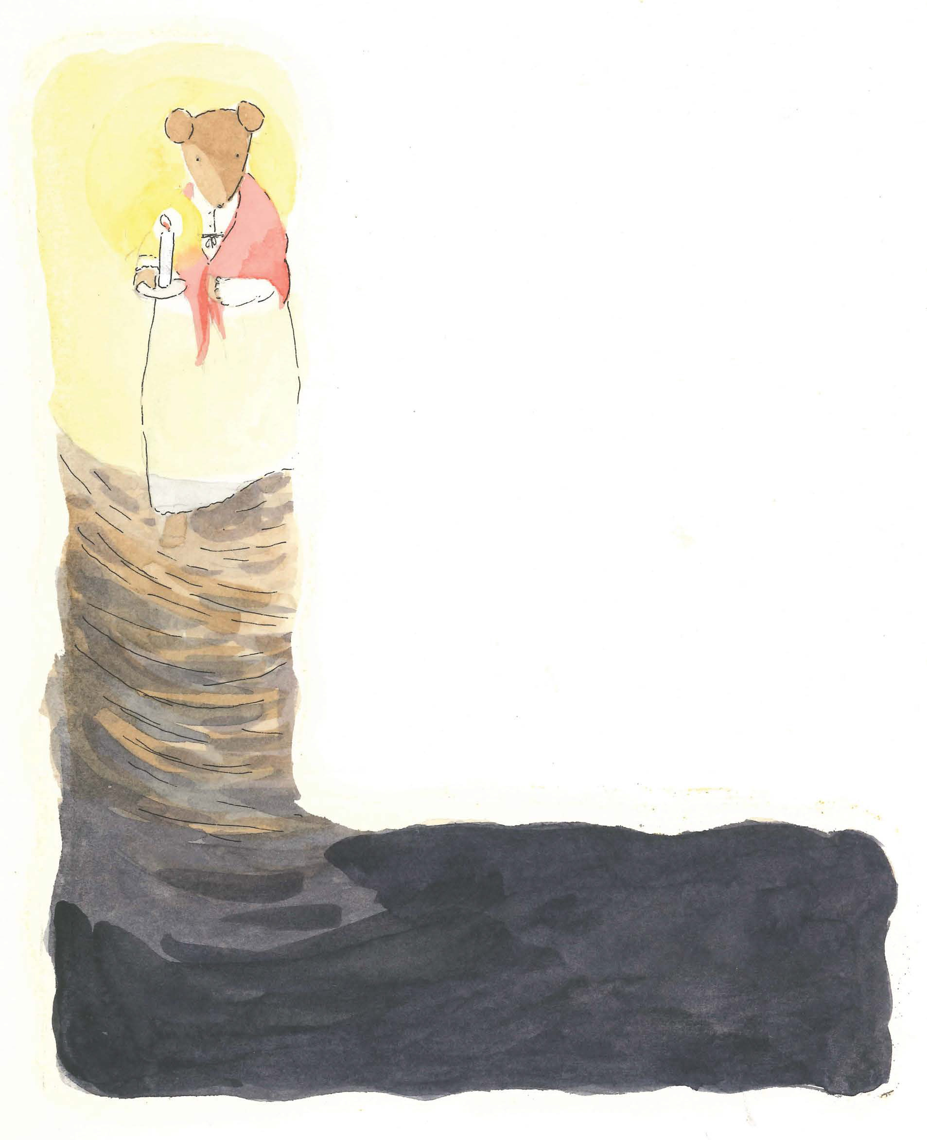
Blue Bottle getting up to Marigold in the night
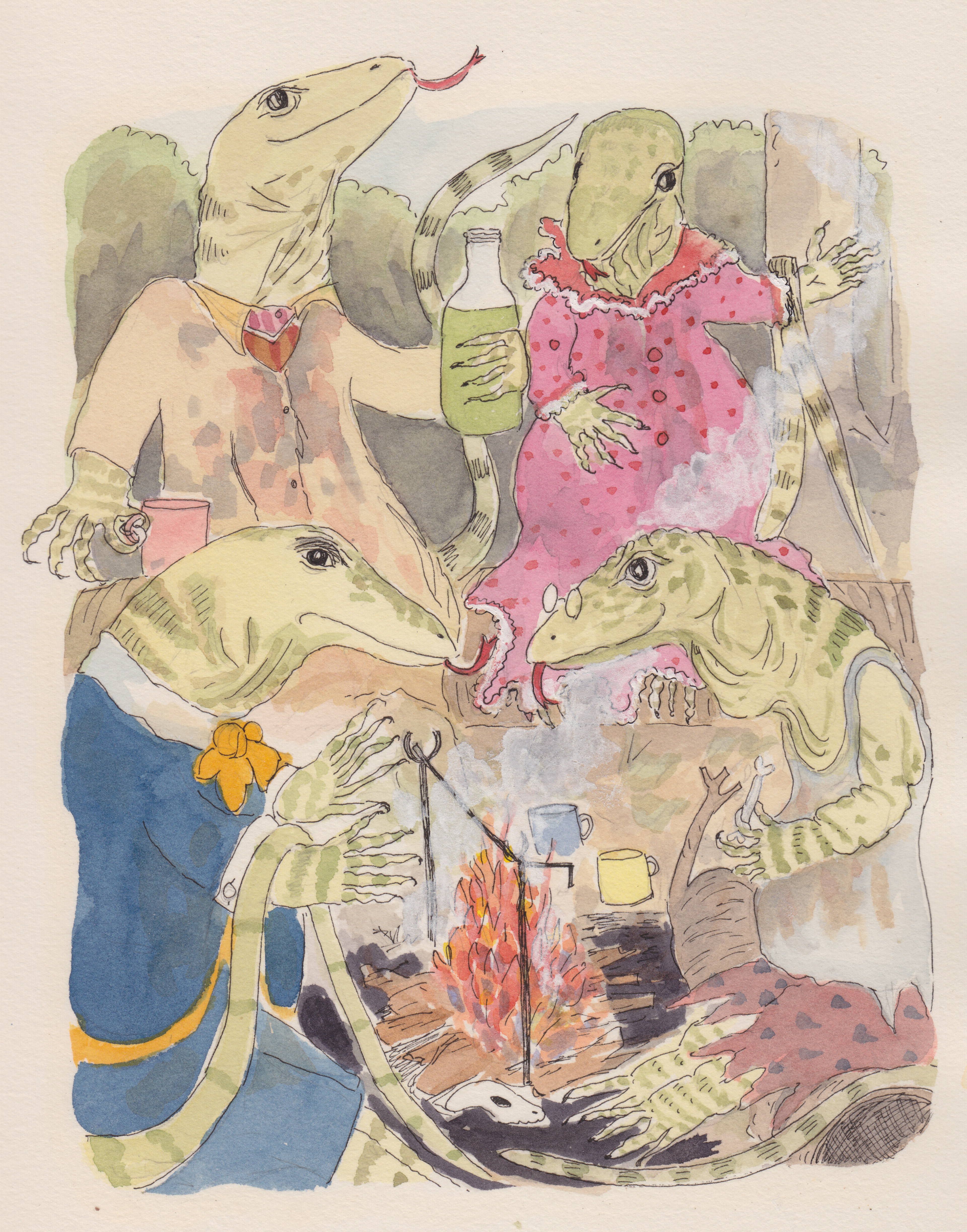
The deadly goannas
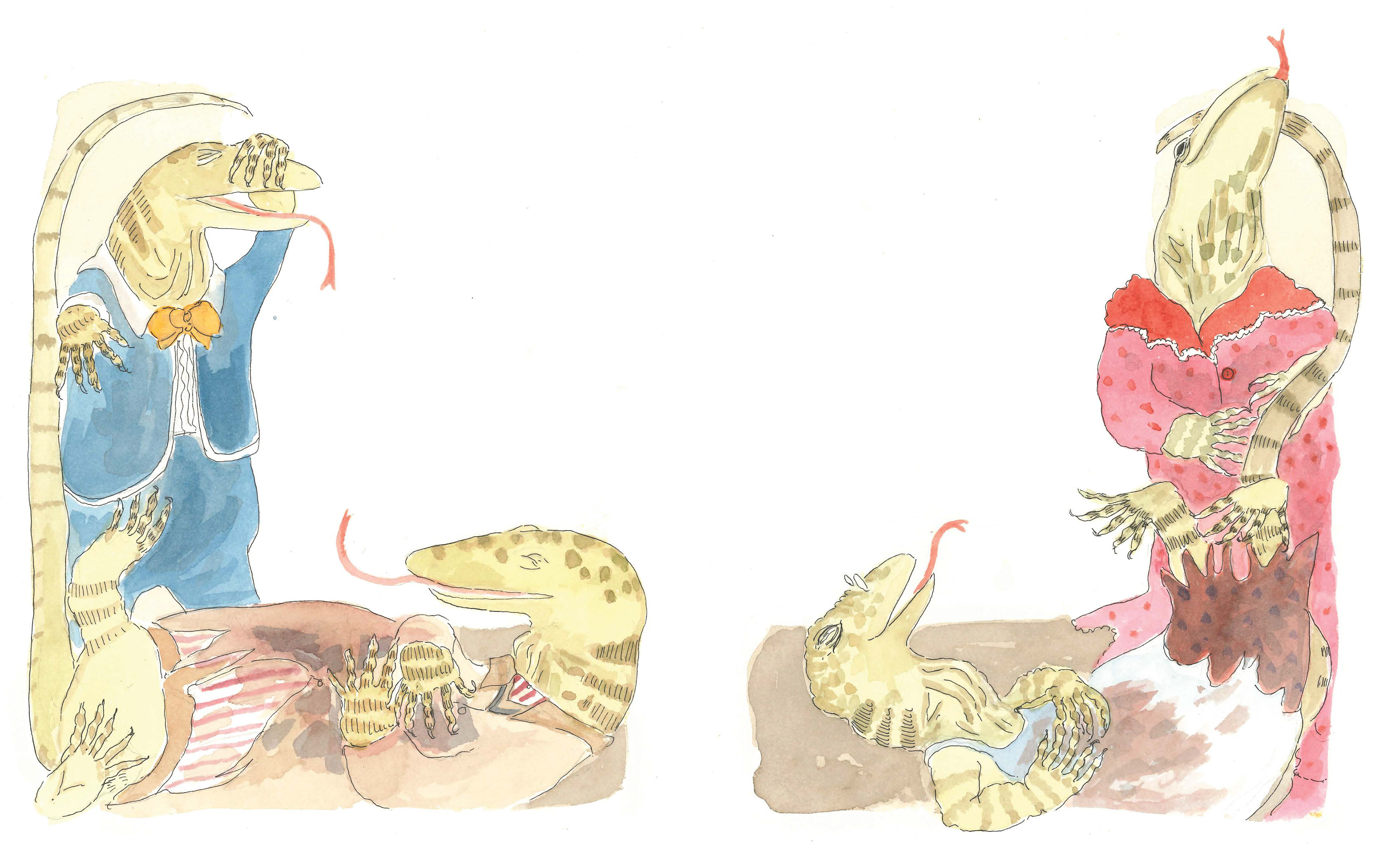
The evil goanna's foiled by their own contagious laugh
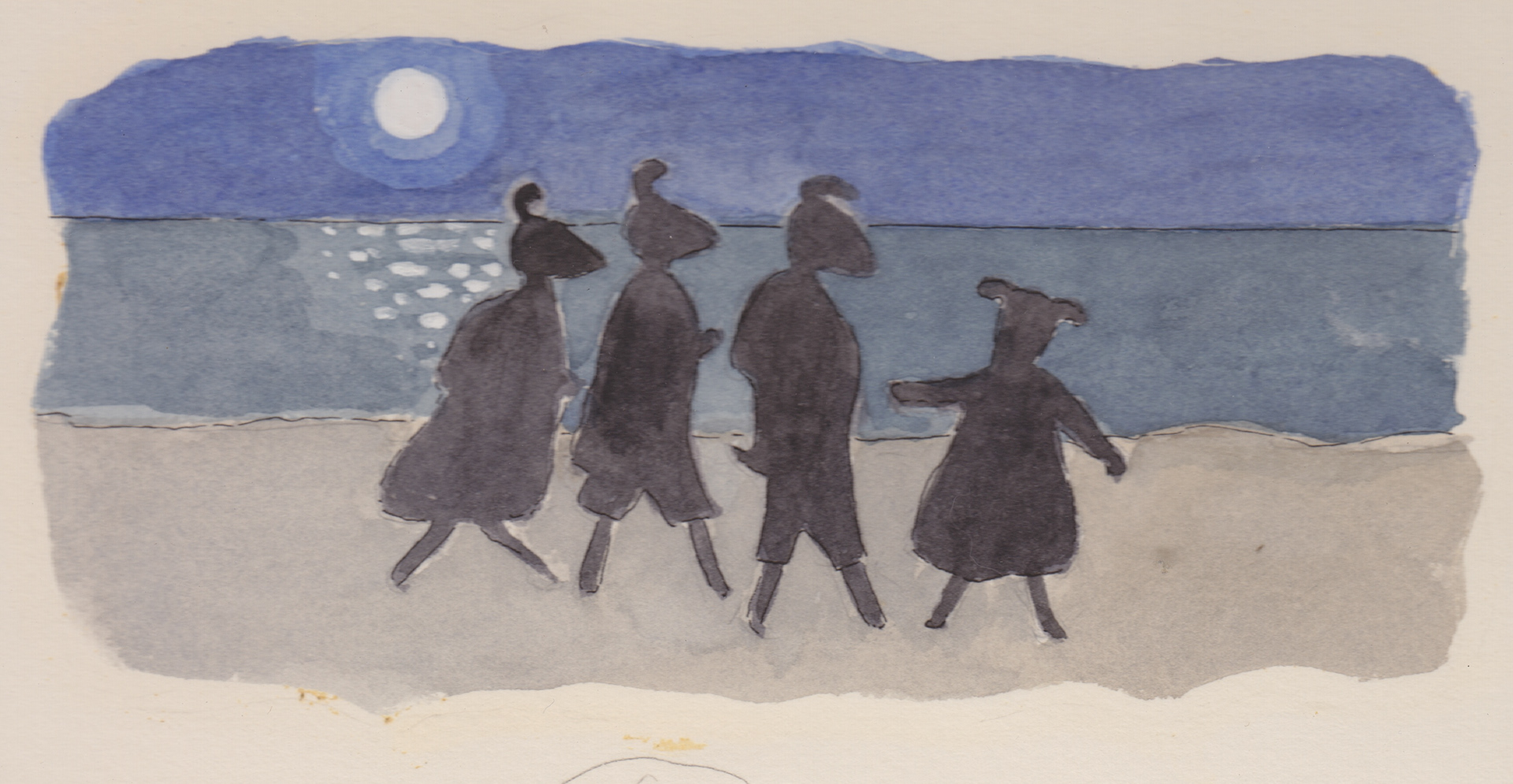
Escape from the goannas
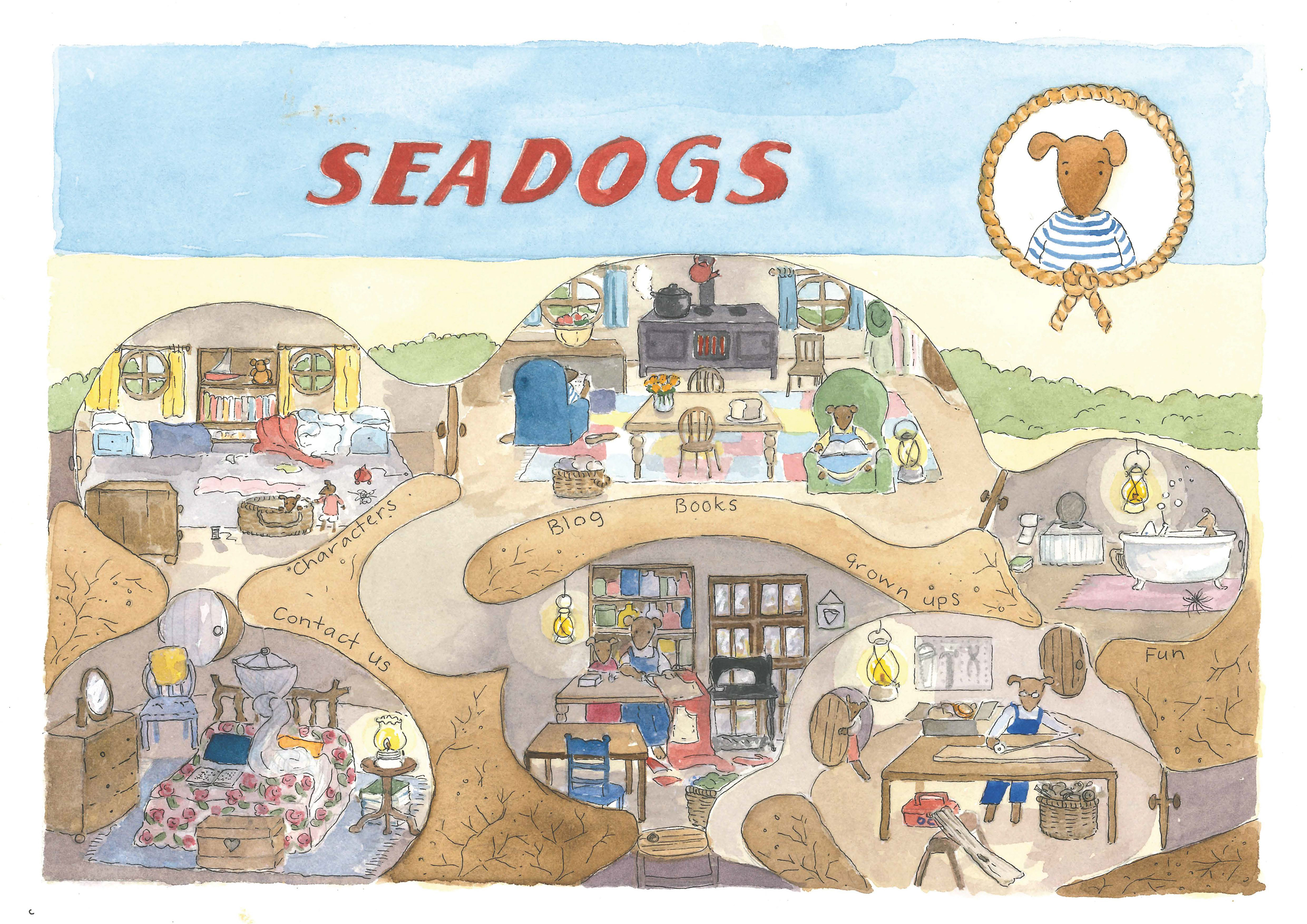
The opening page on the seadogs website
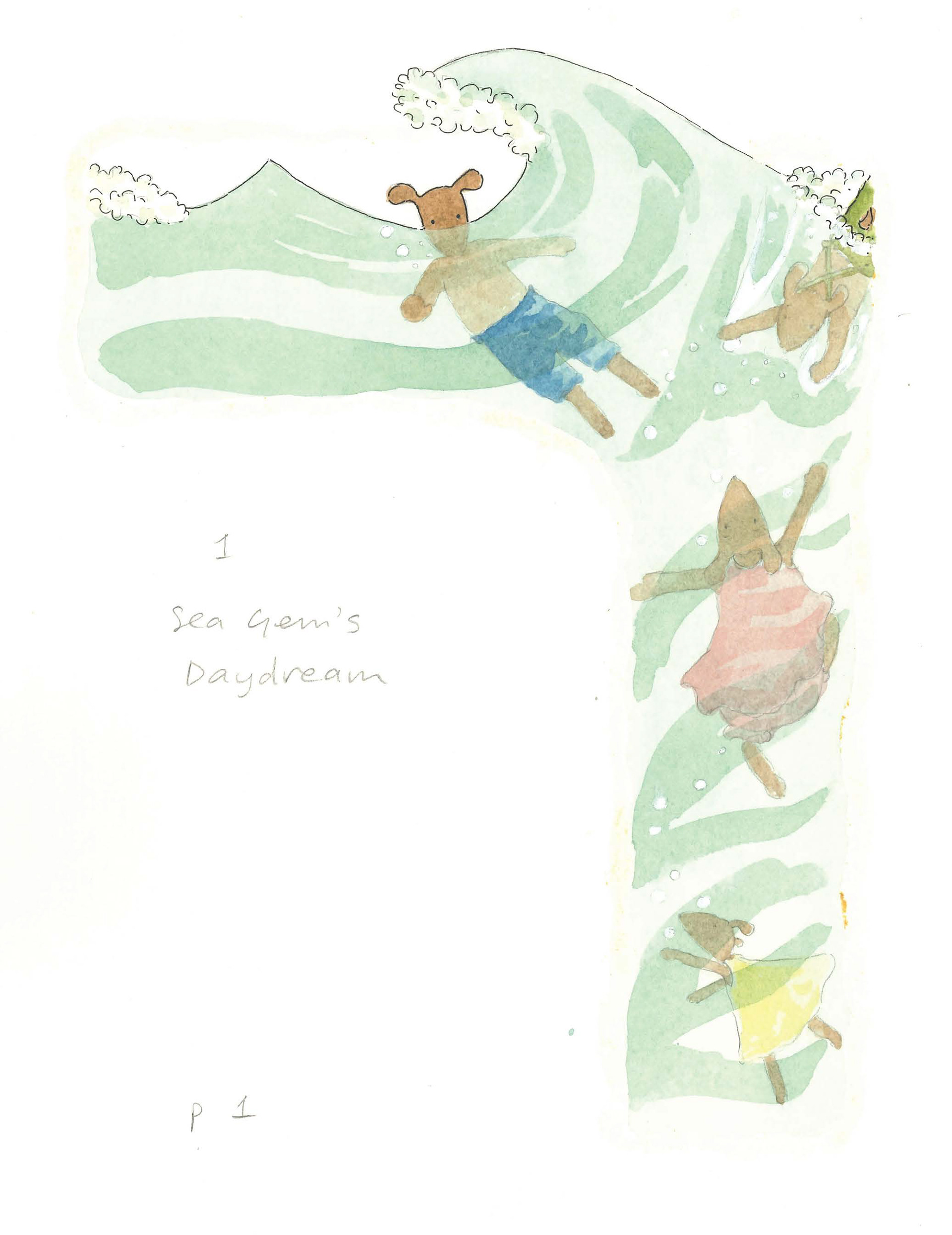
The seadogs swimming in Foamy Bay's warm waters
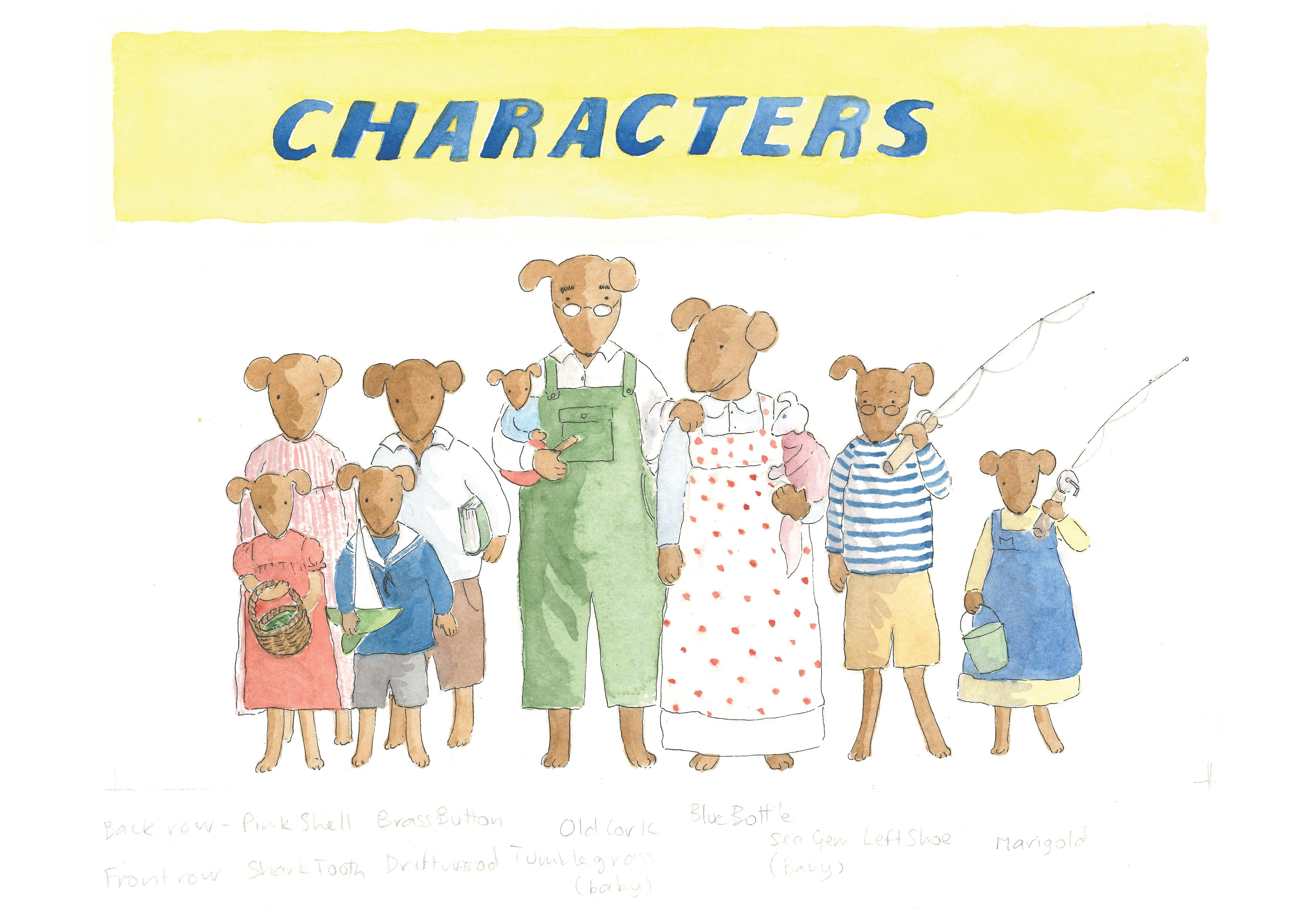
Paintings for my website- www.seadogs.com.au
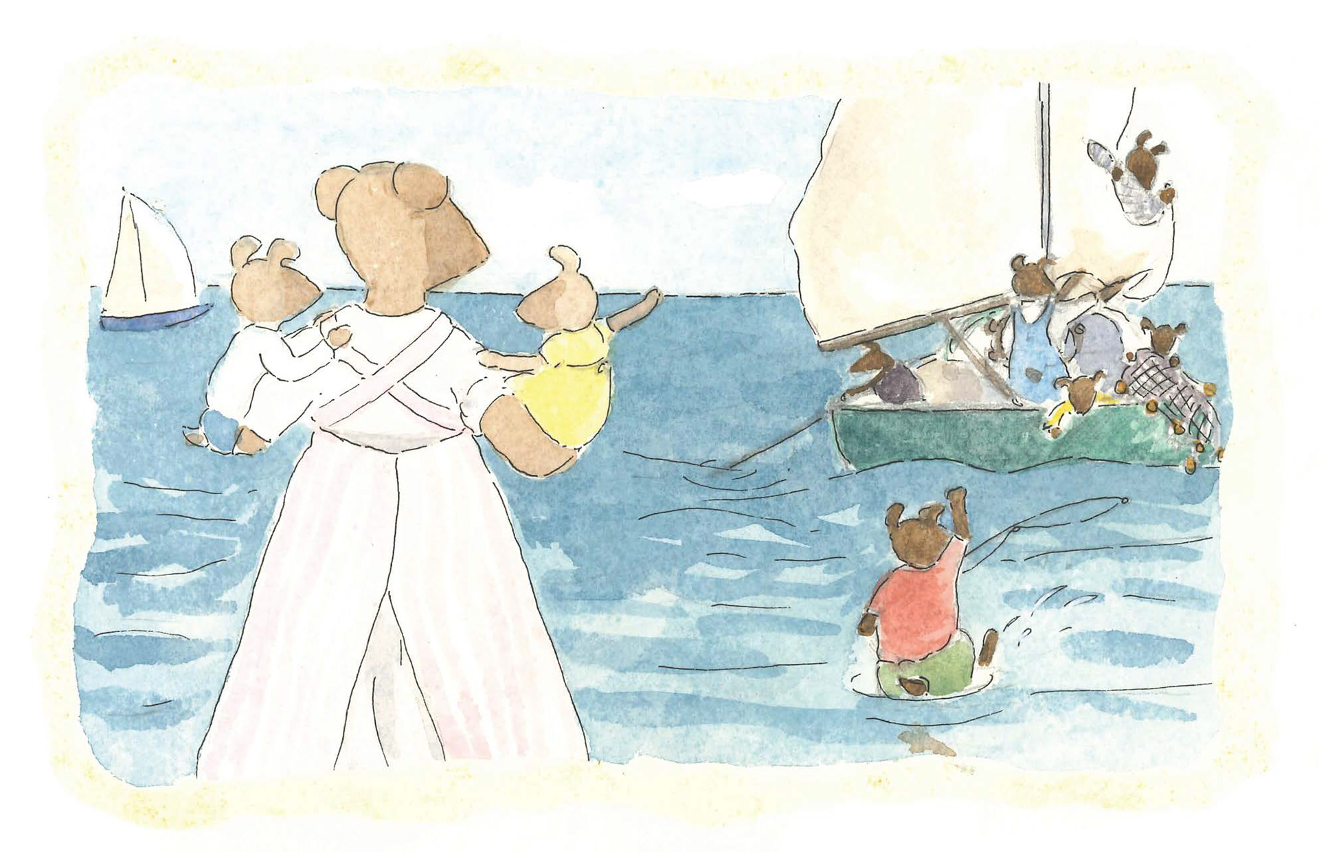
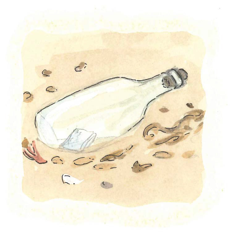
Message in a bottle!
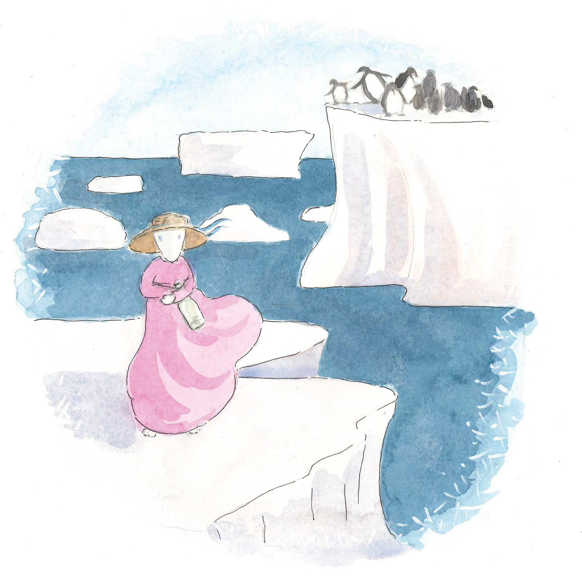
Sea Gem's vision
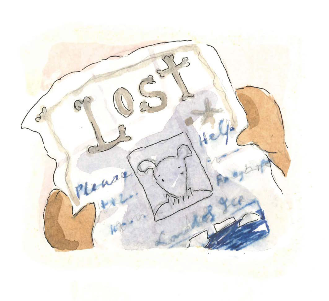
The mysterious message
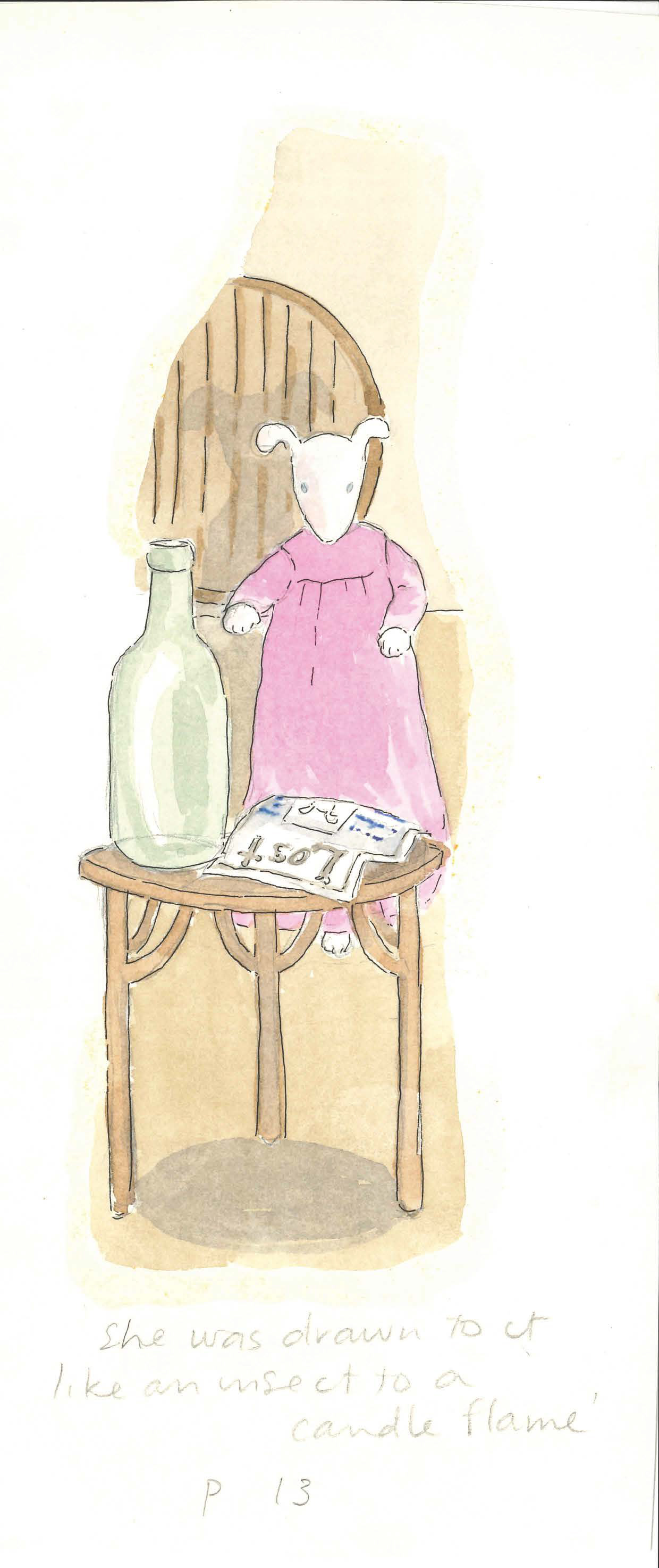
Sea Gem is drawn to the bottle once again
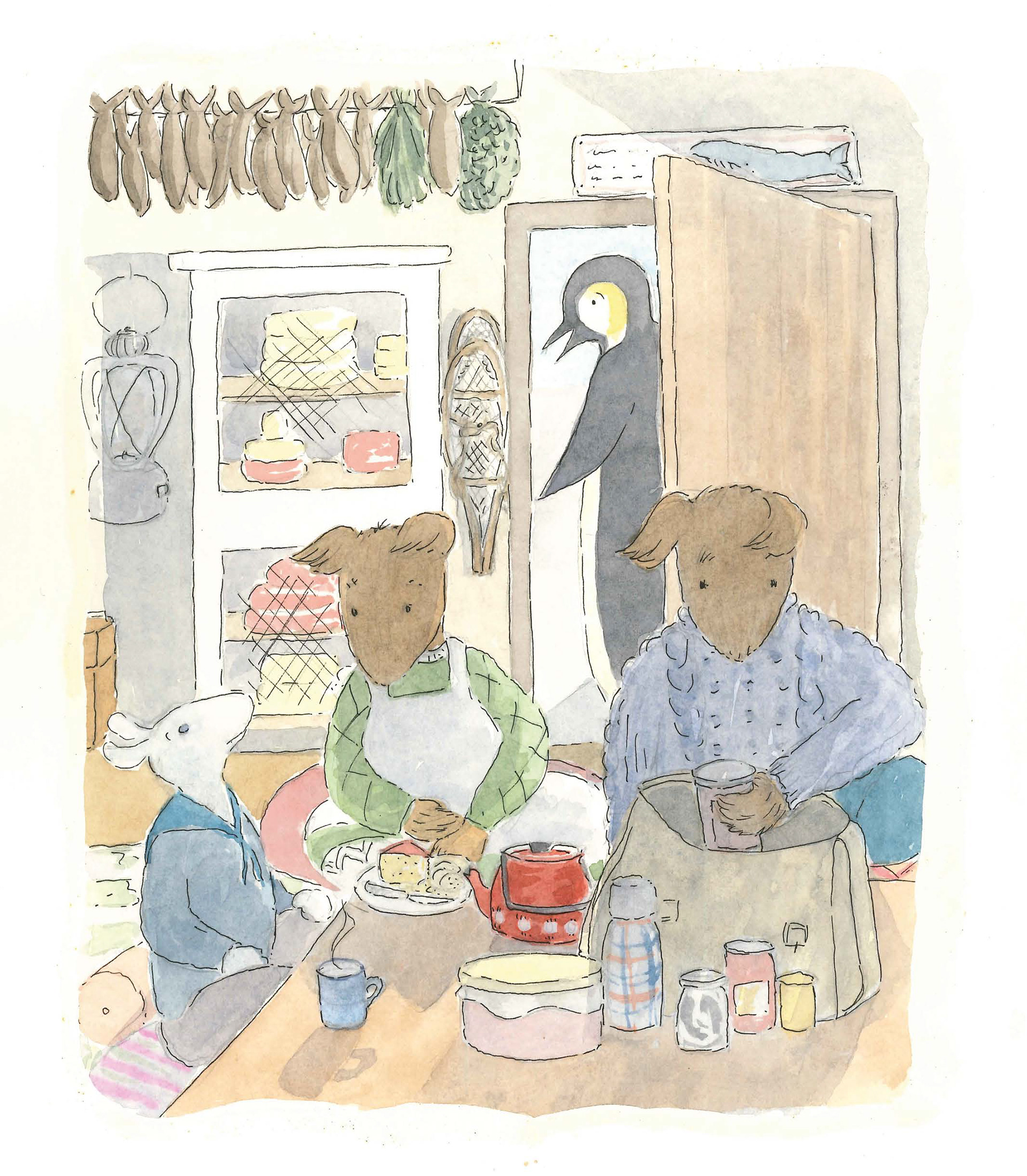
Captain Hail's cottage
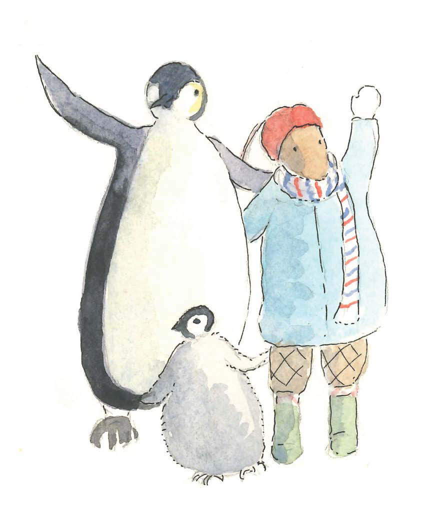
Percy and Frayed Rope say farewell
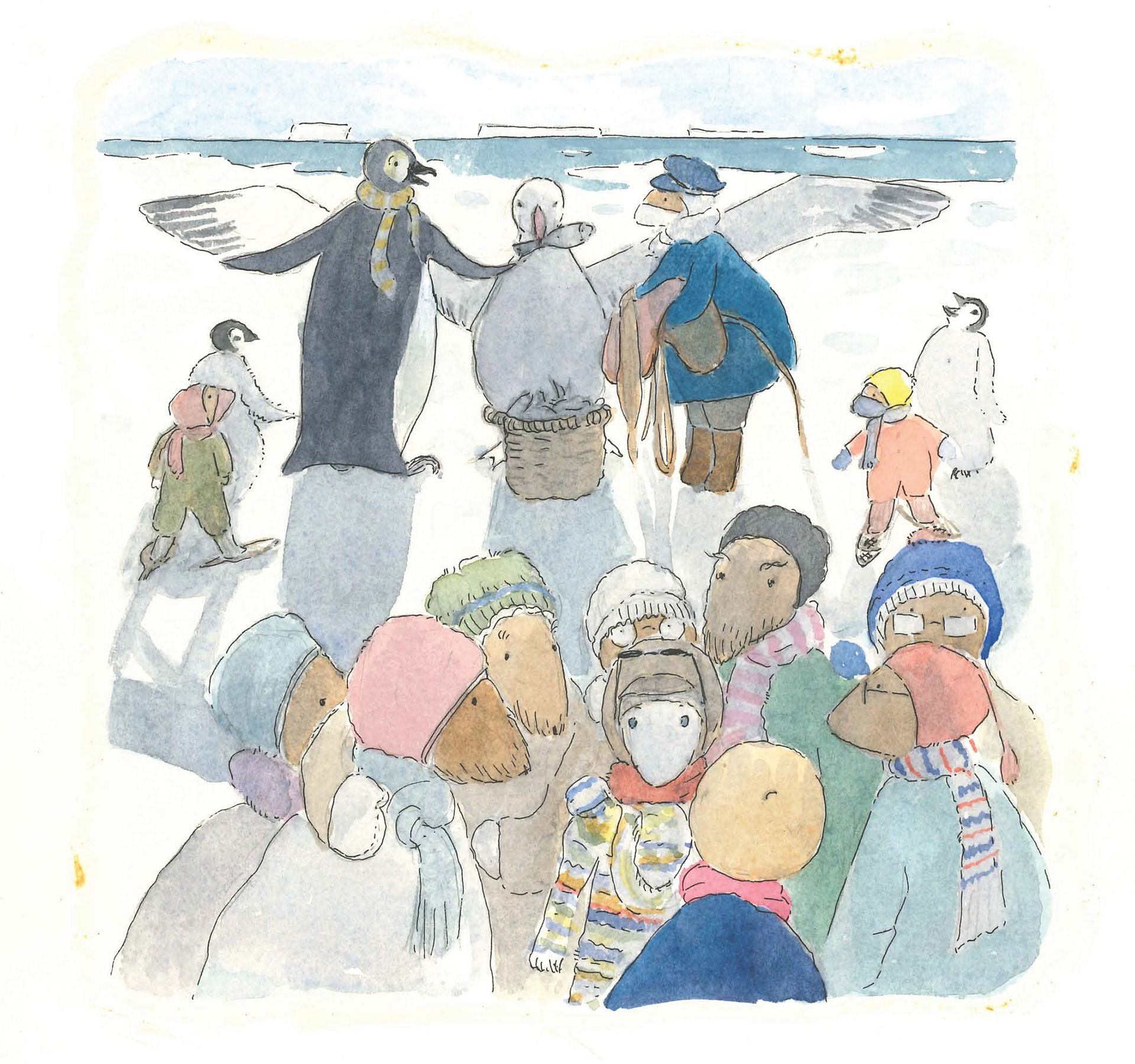
The journey home via albatross
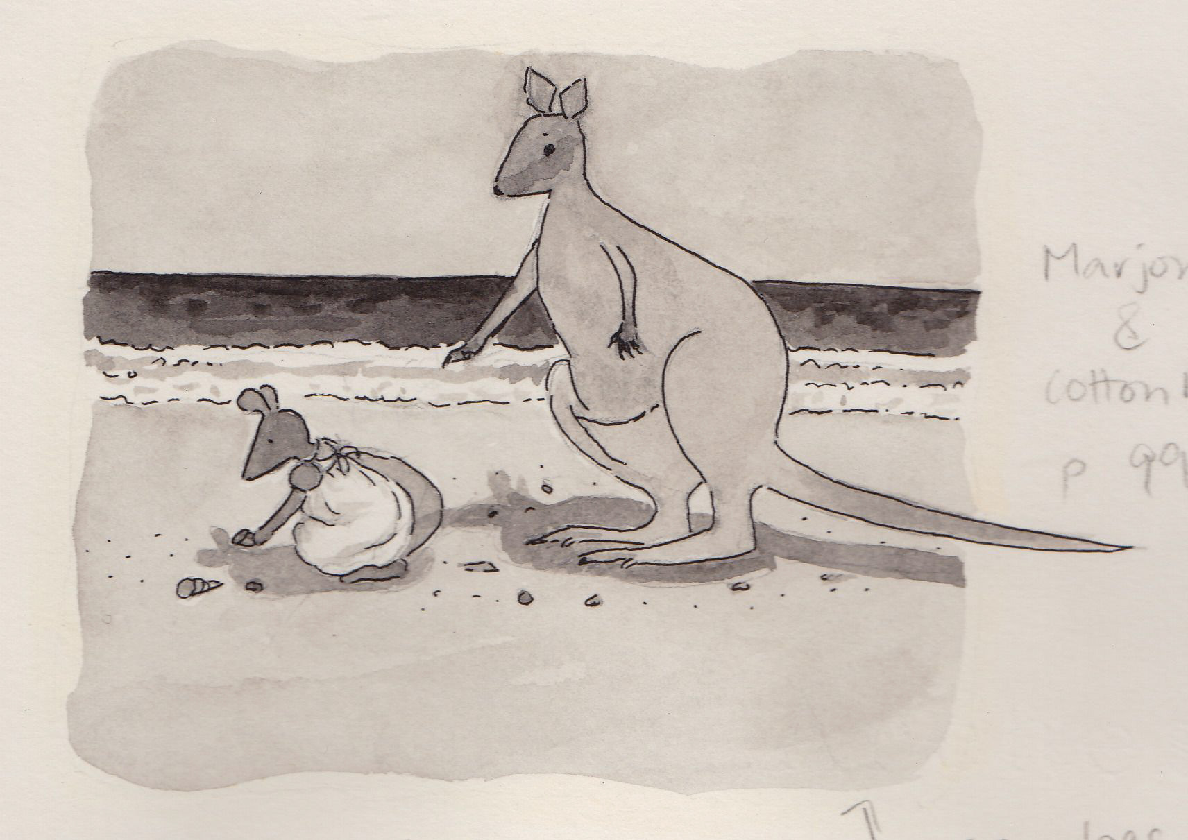
Cotton Reel with her new friend Marjory
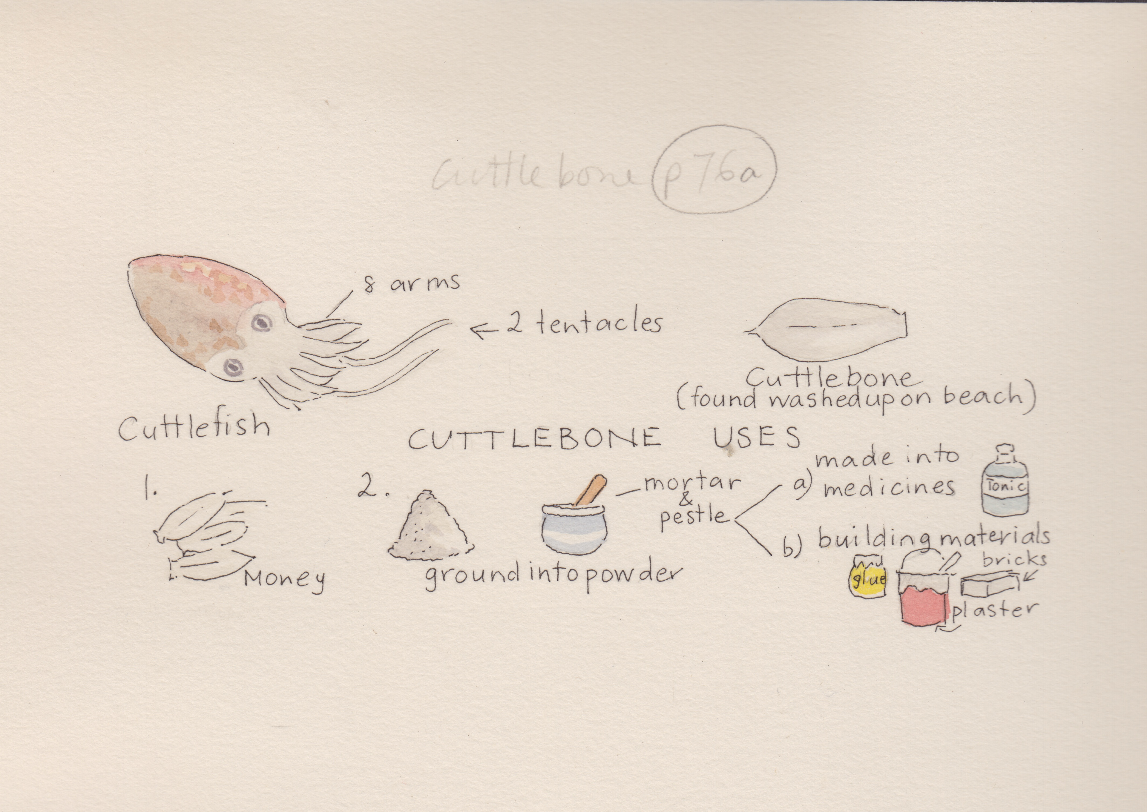
The seadog uses for cuttlebone
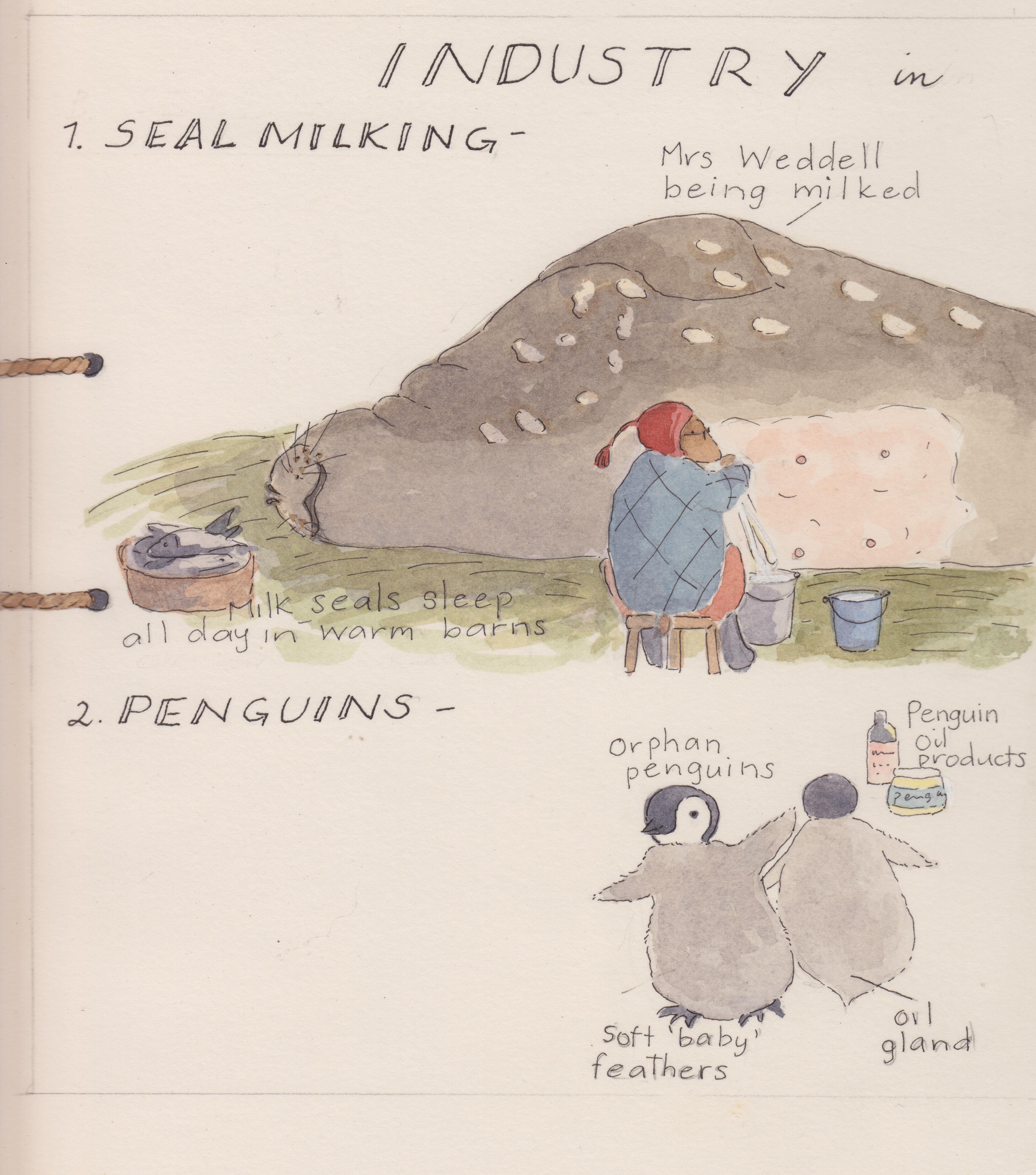
Seal milking
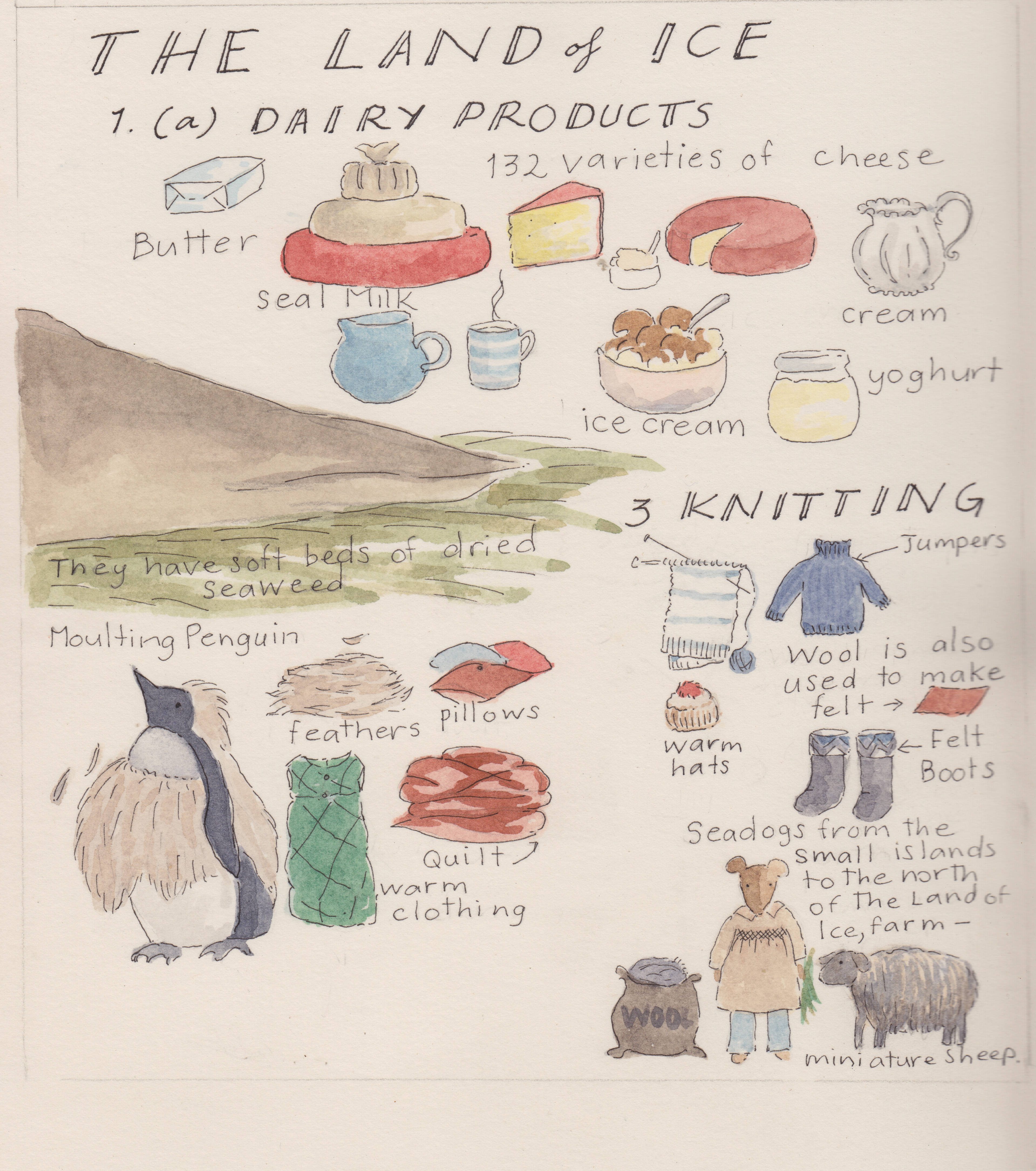
Produce from the land of ice
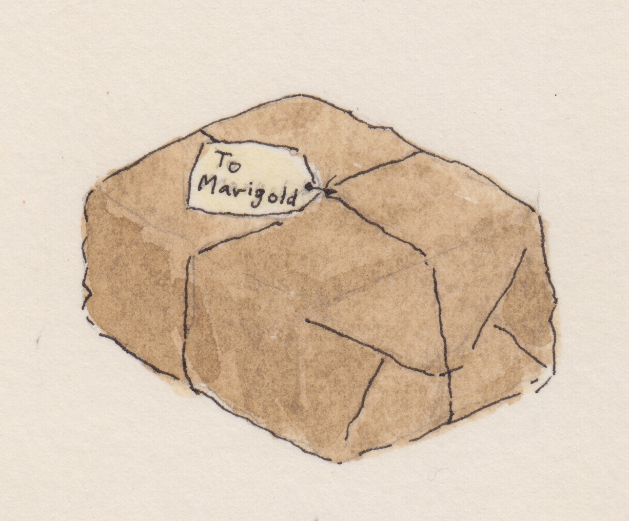
A special package from the Land of Ice
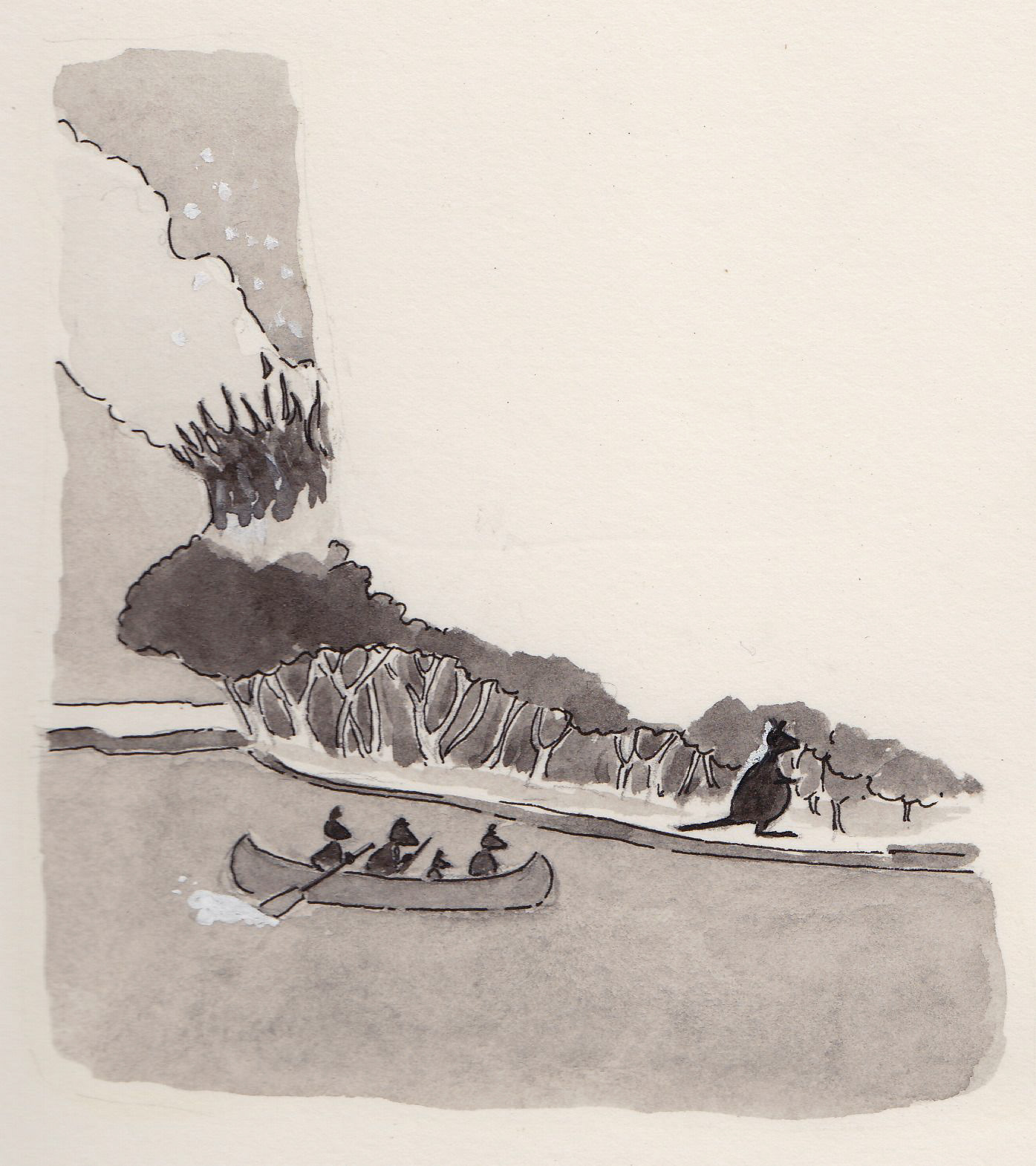
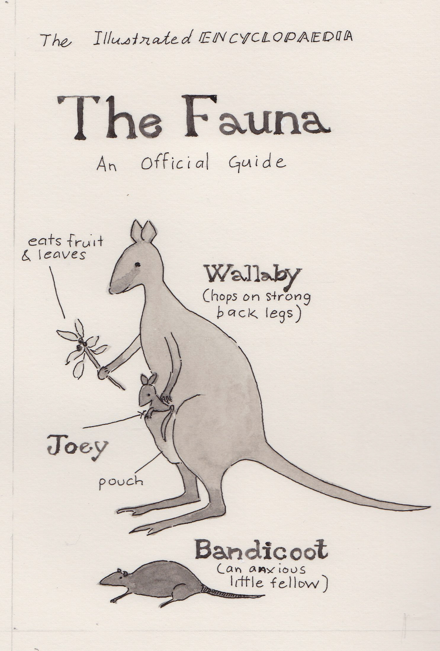
Some local fauna
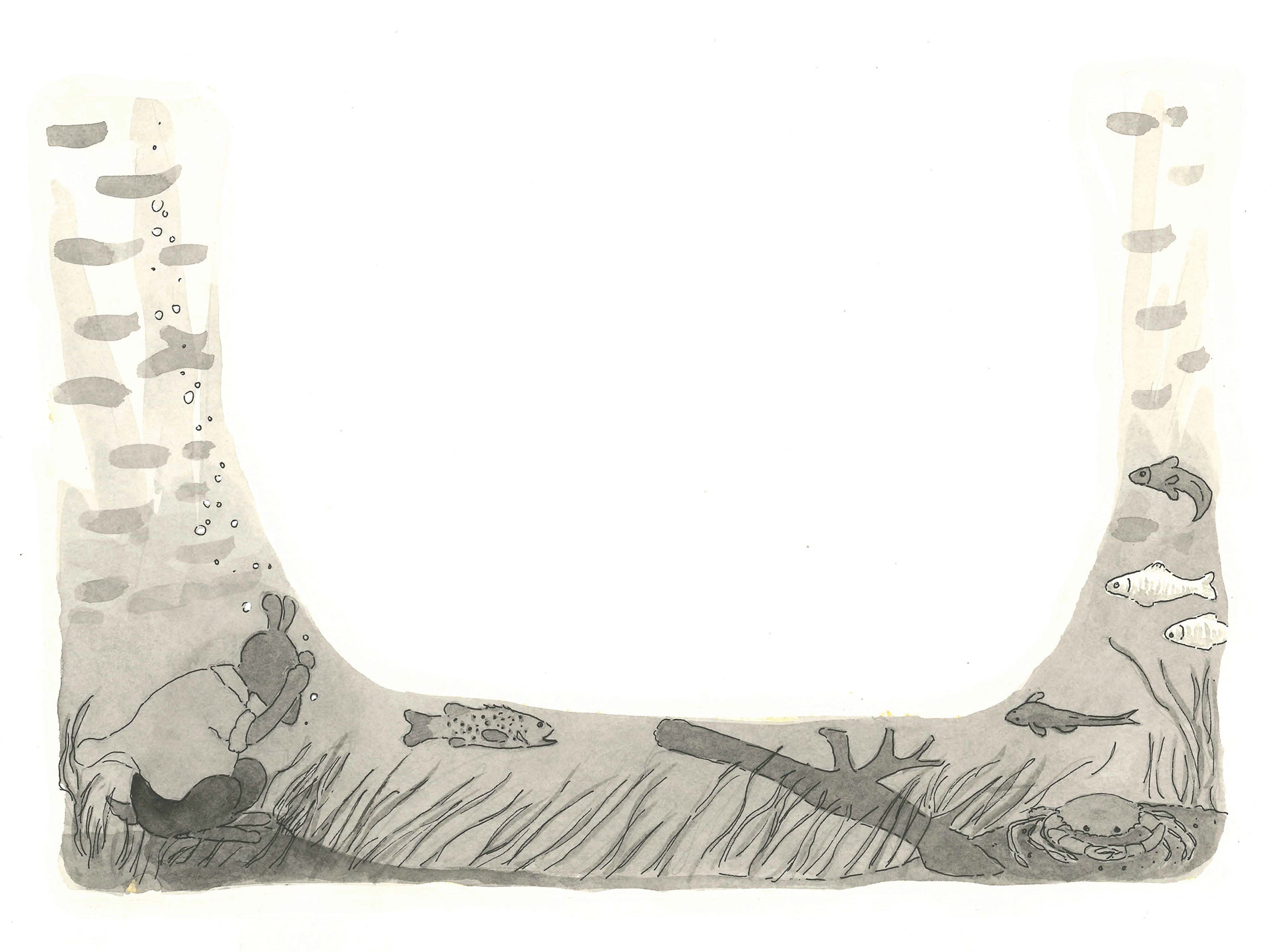
Tumblegrass' "blue page"
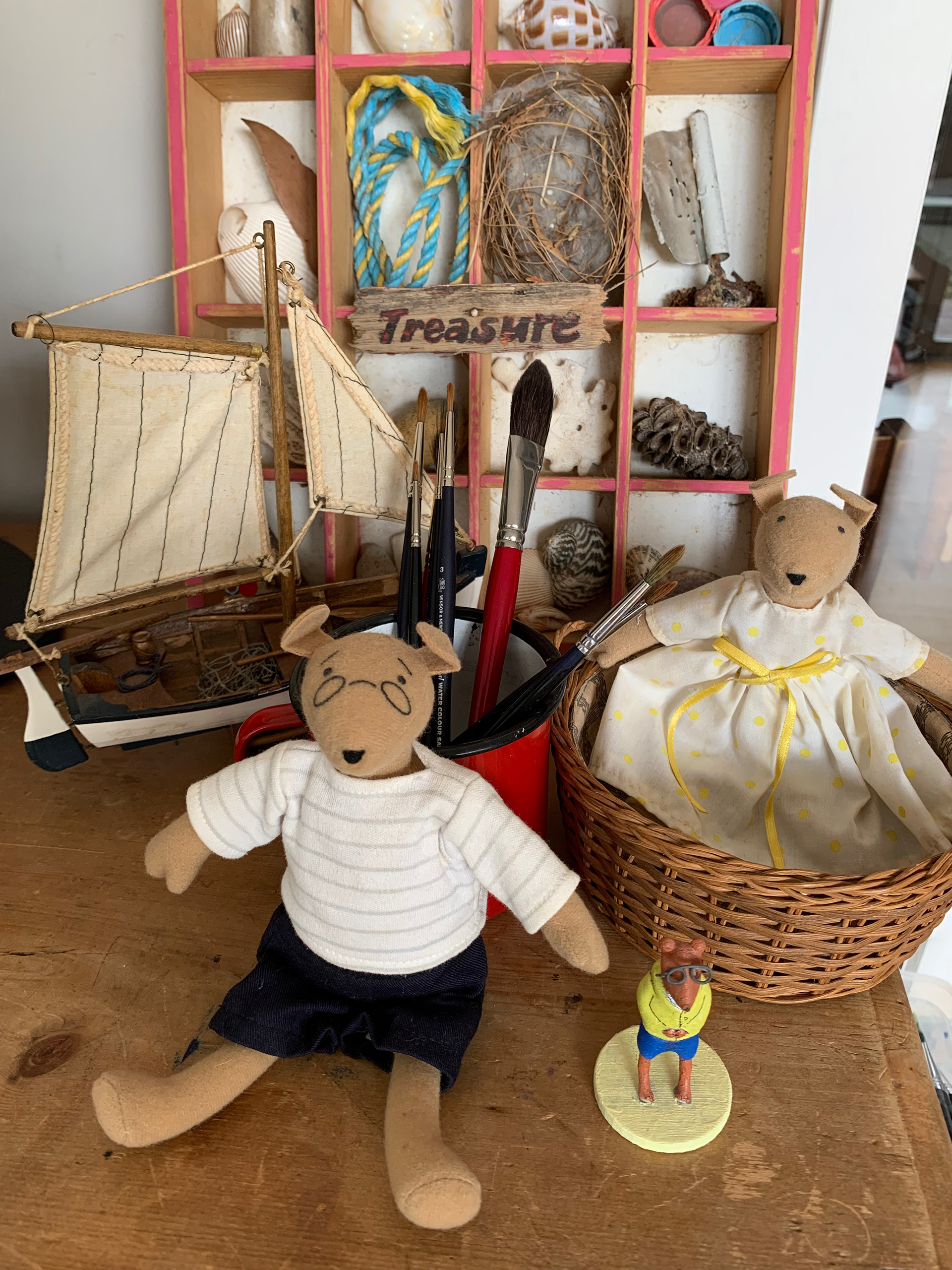
Seadog toys- Left Shoe and Marigold
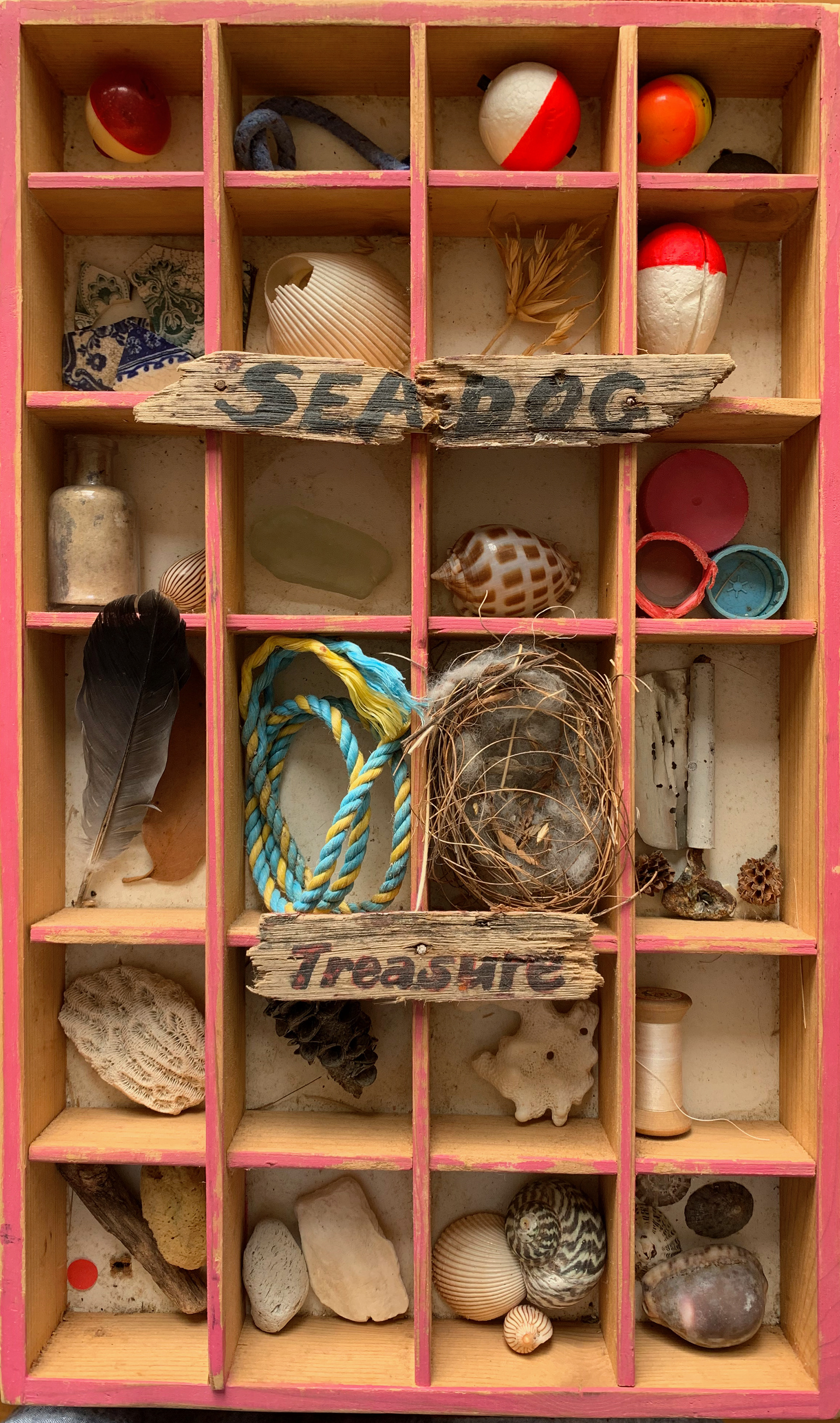
A display for my book talks- Seadog Treasure
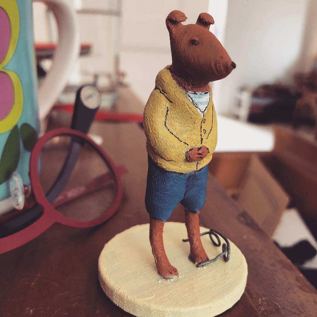
Thomas made me this Left Shoe figurine with his 3D printer
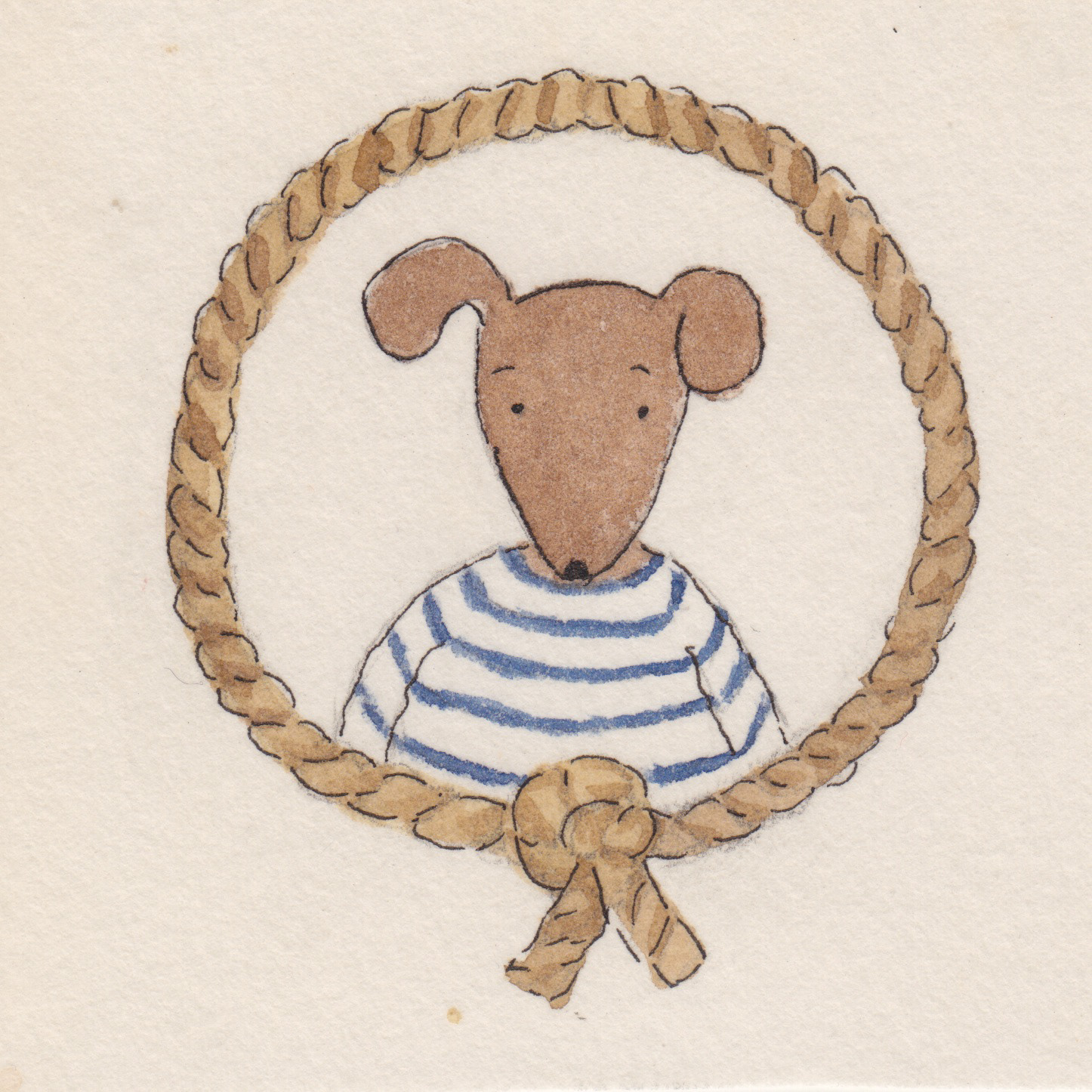
The logo for Seadog Adventures
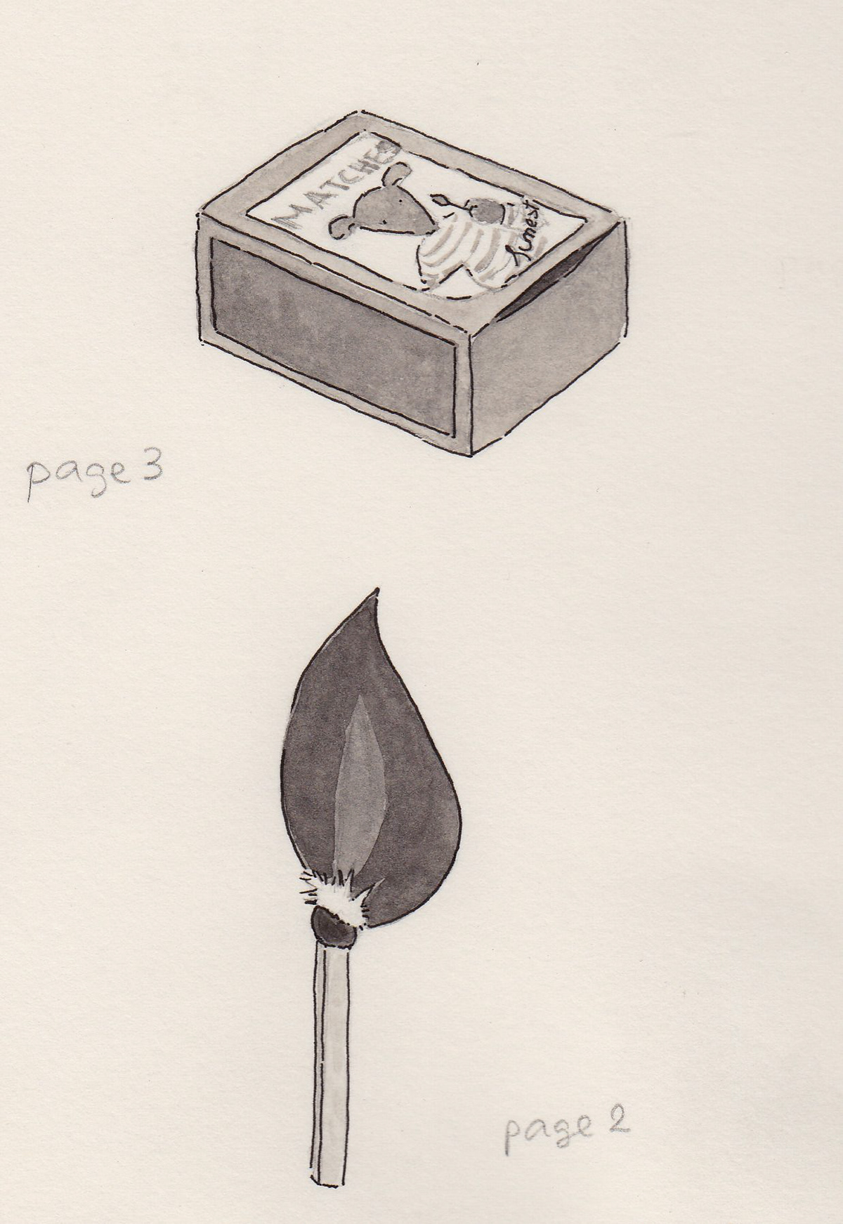
The forbidden match
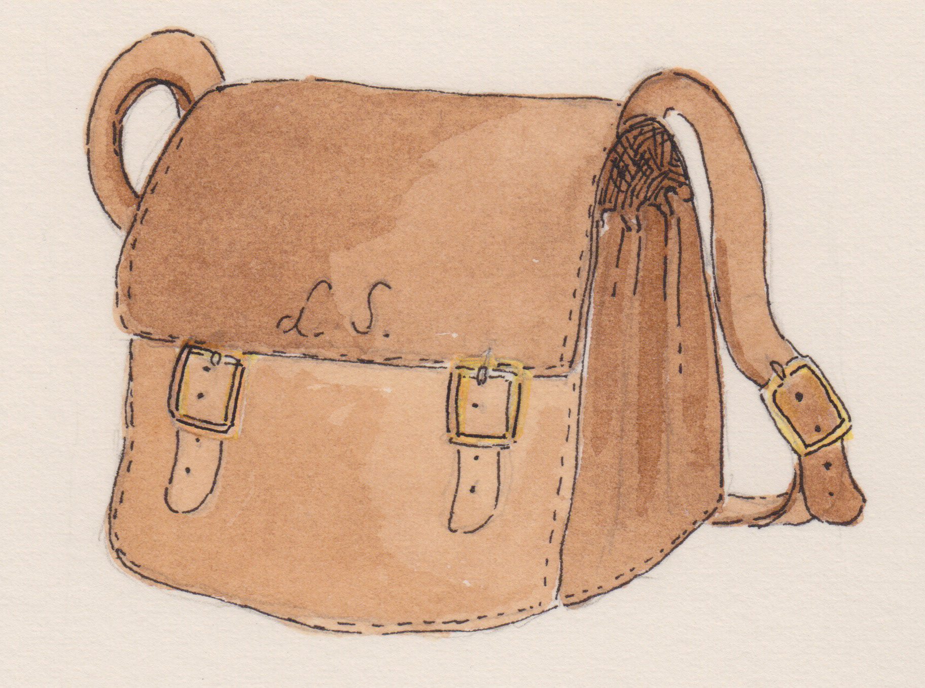
Left Shoe's satchel
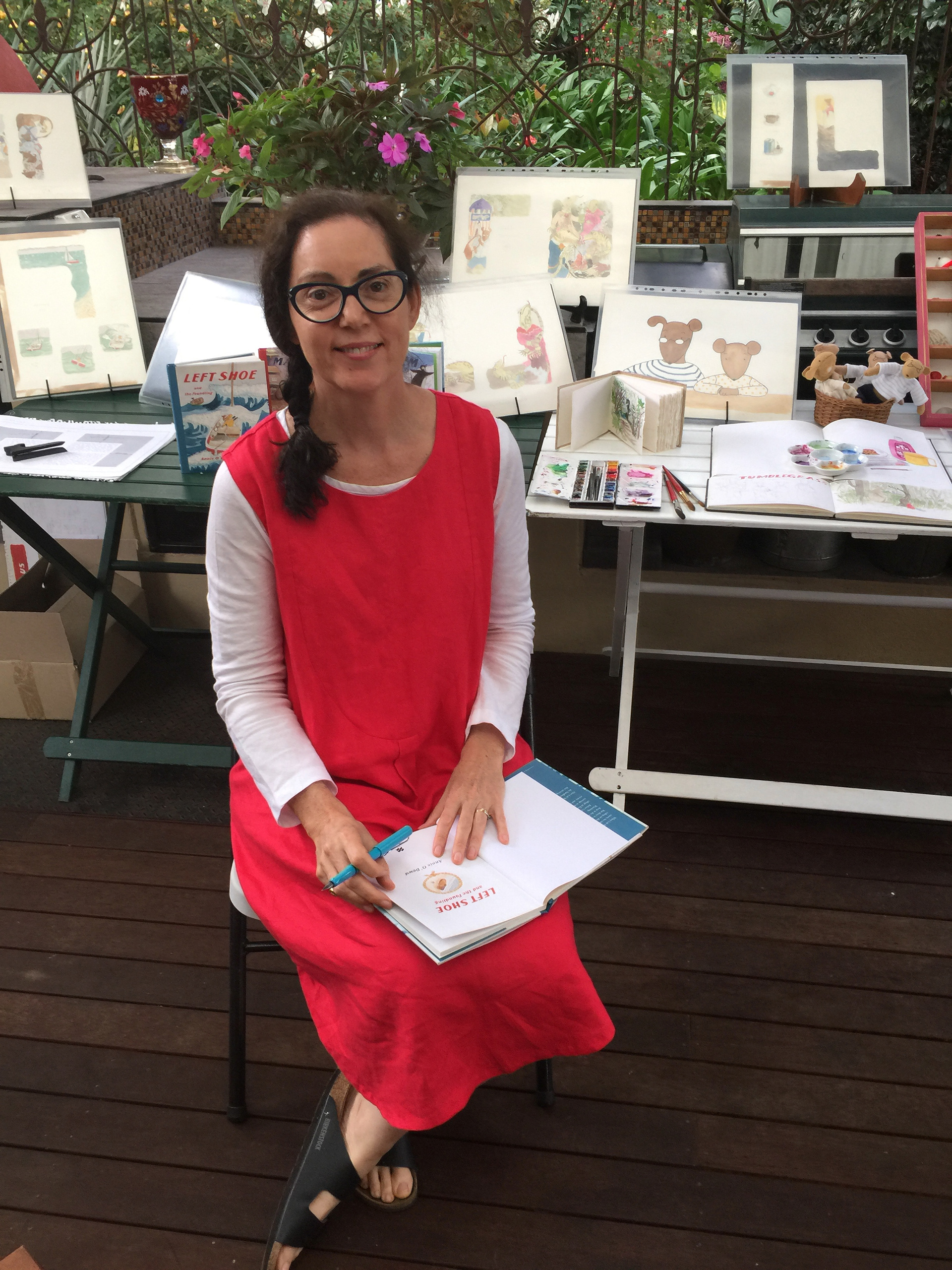
A book talk presentation
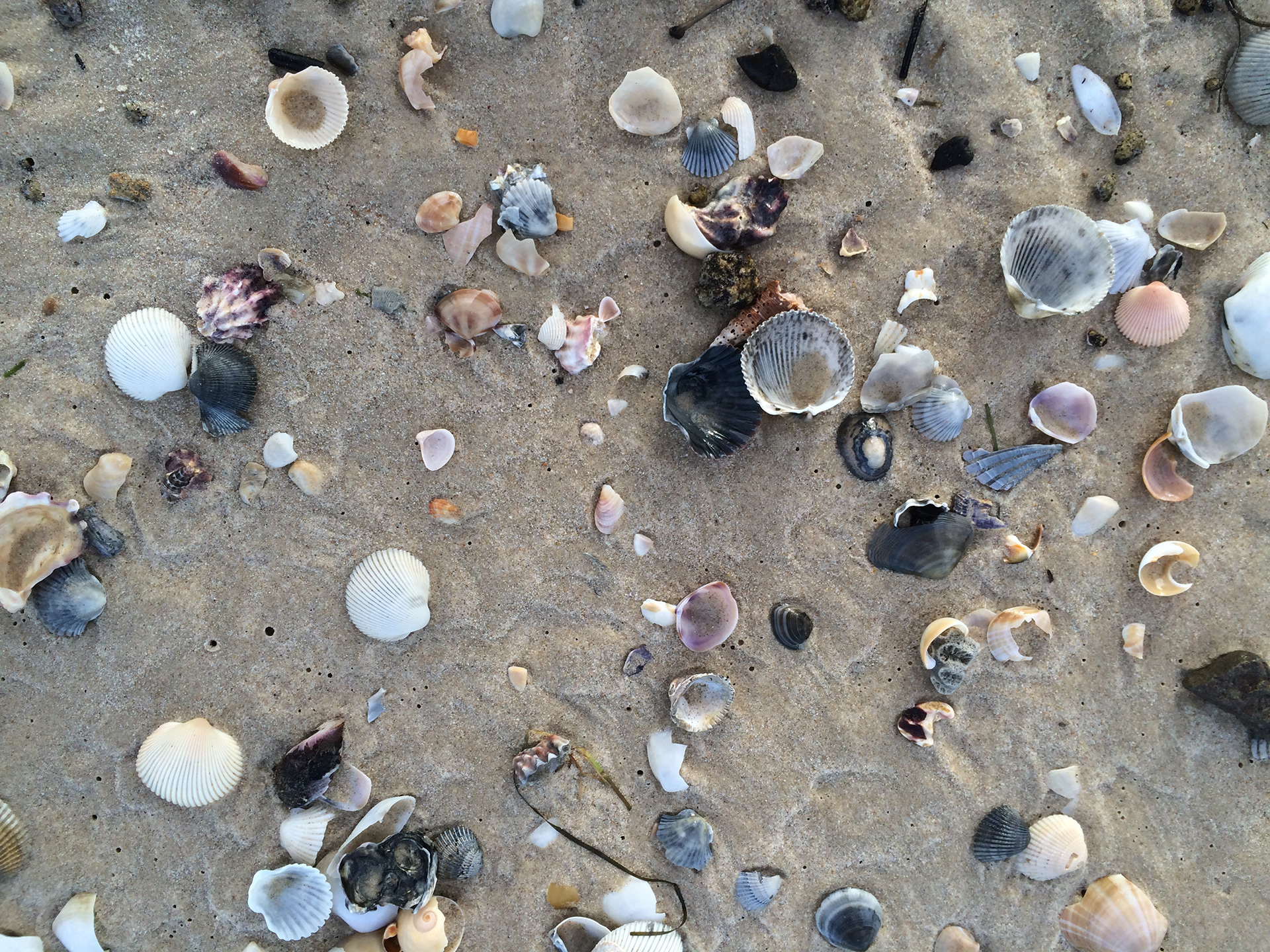
Some seadog treasure
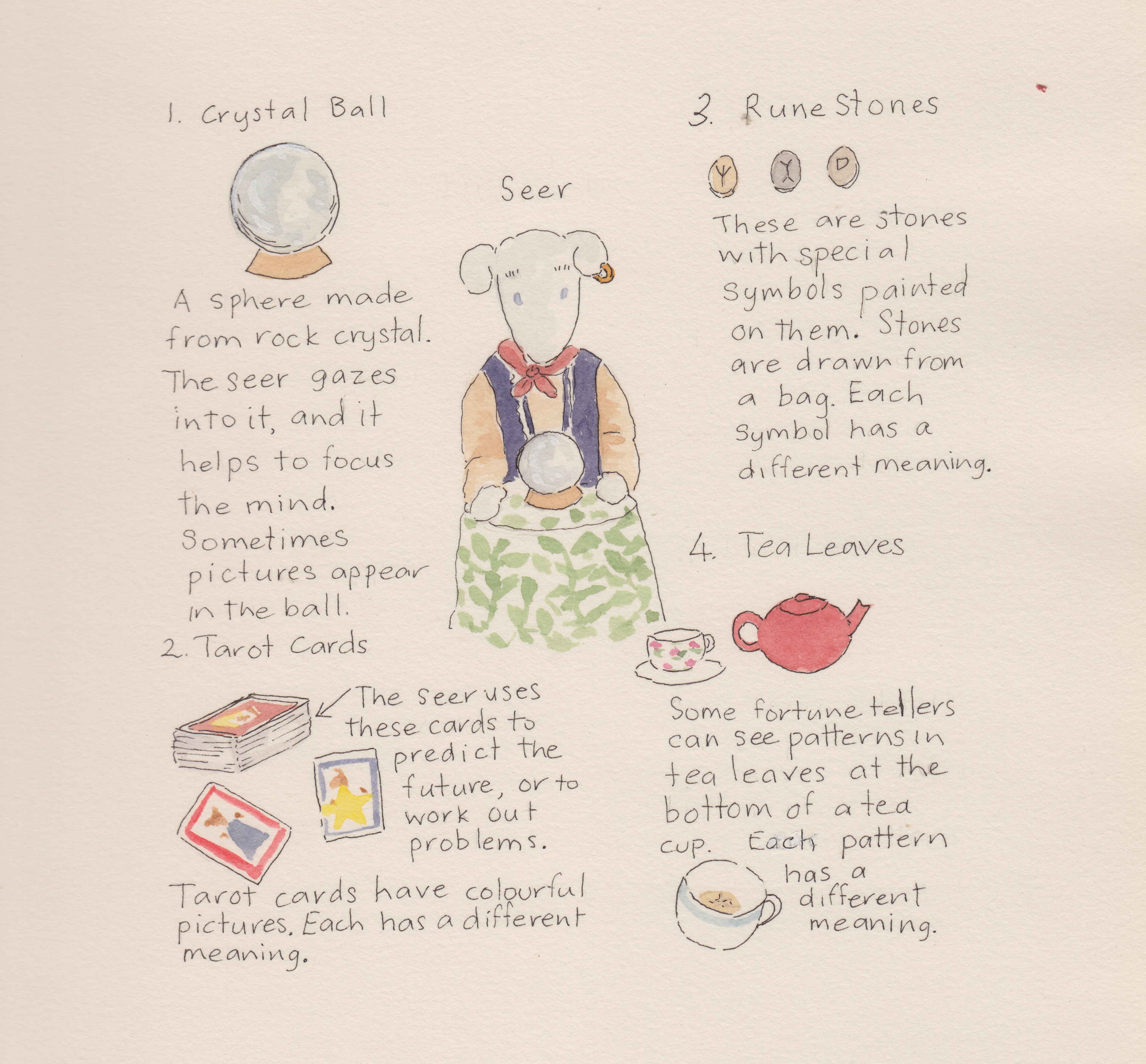
From the Almanac of Strange Things- 'Marigold and the Dark'
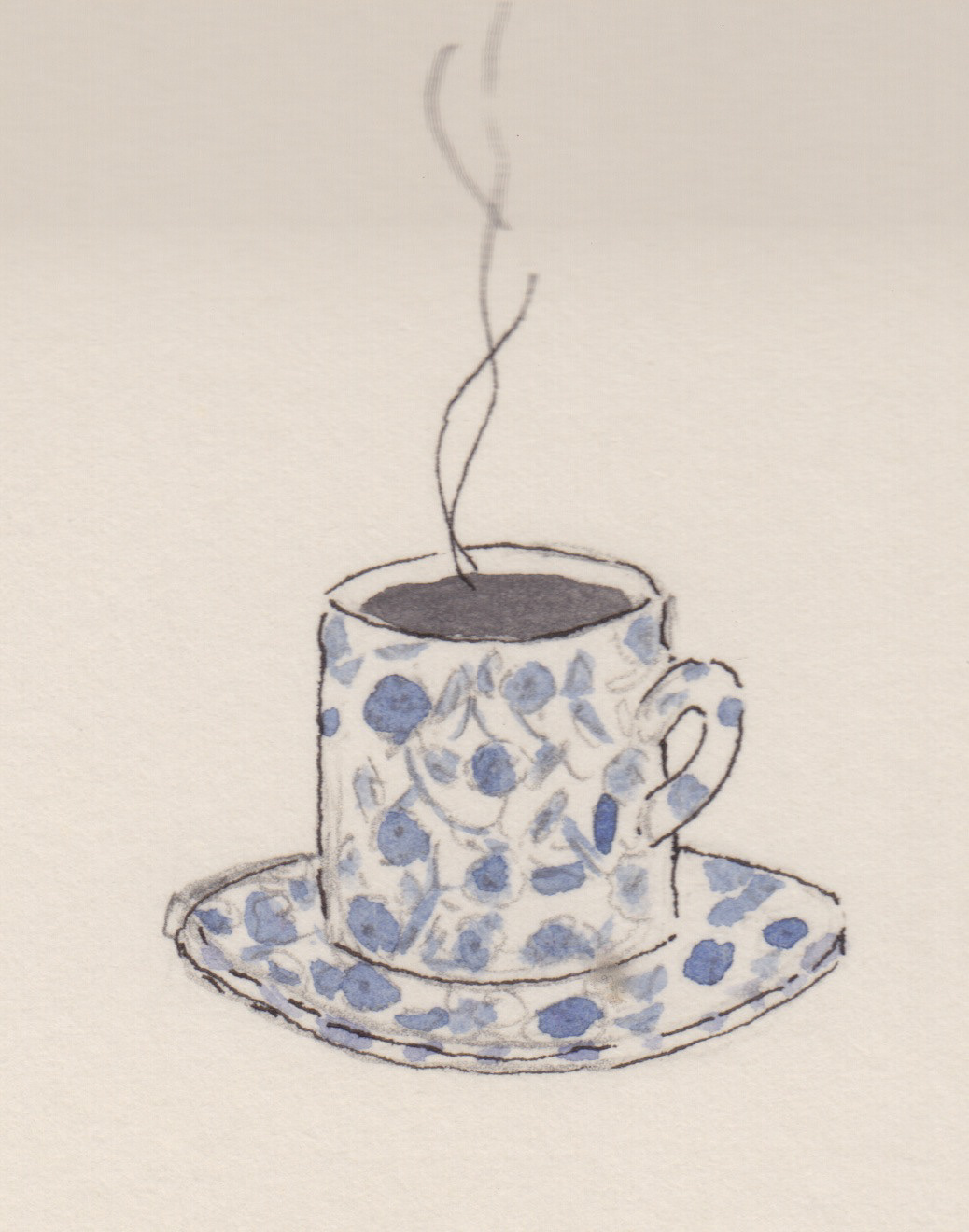
A cup of squink
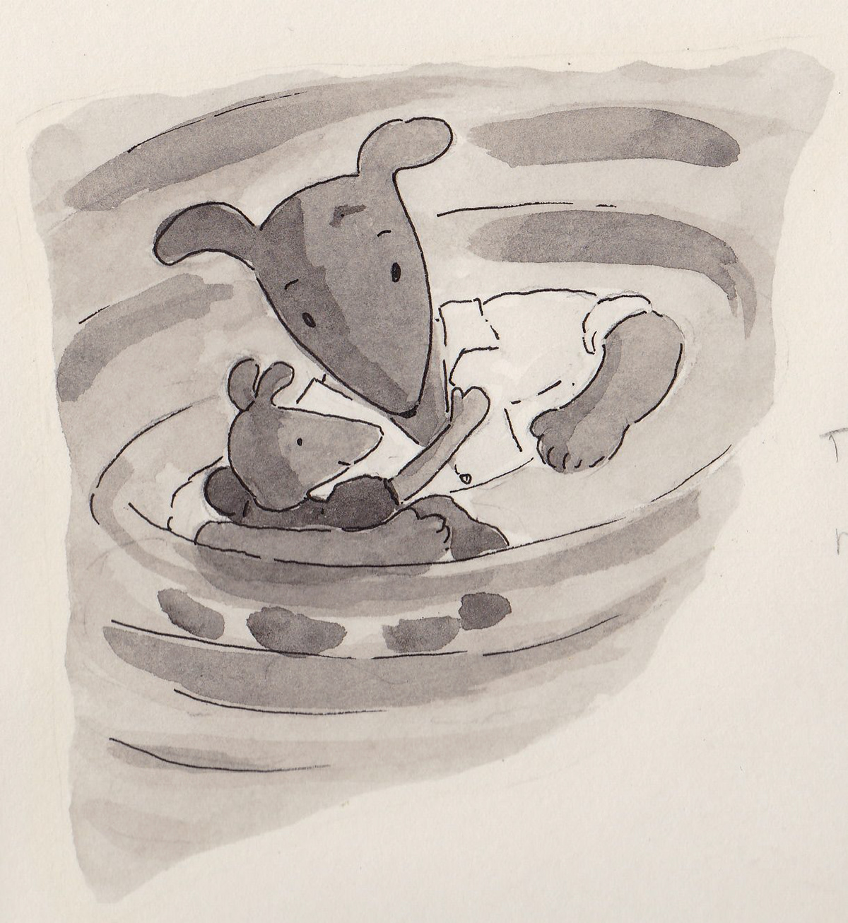
Tangle and Cotton Reel
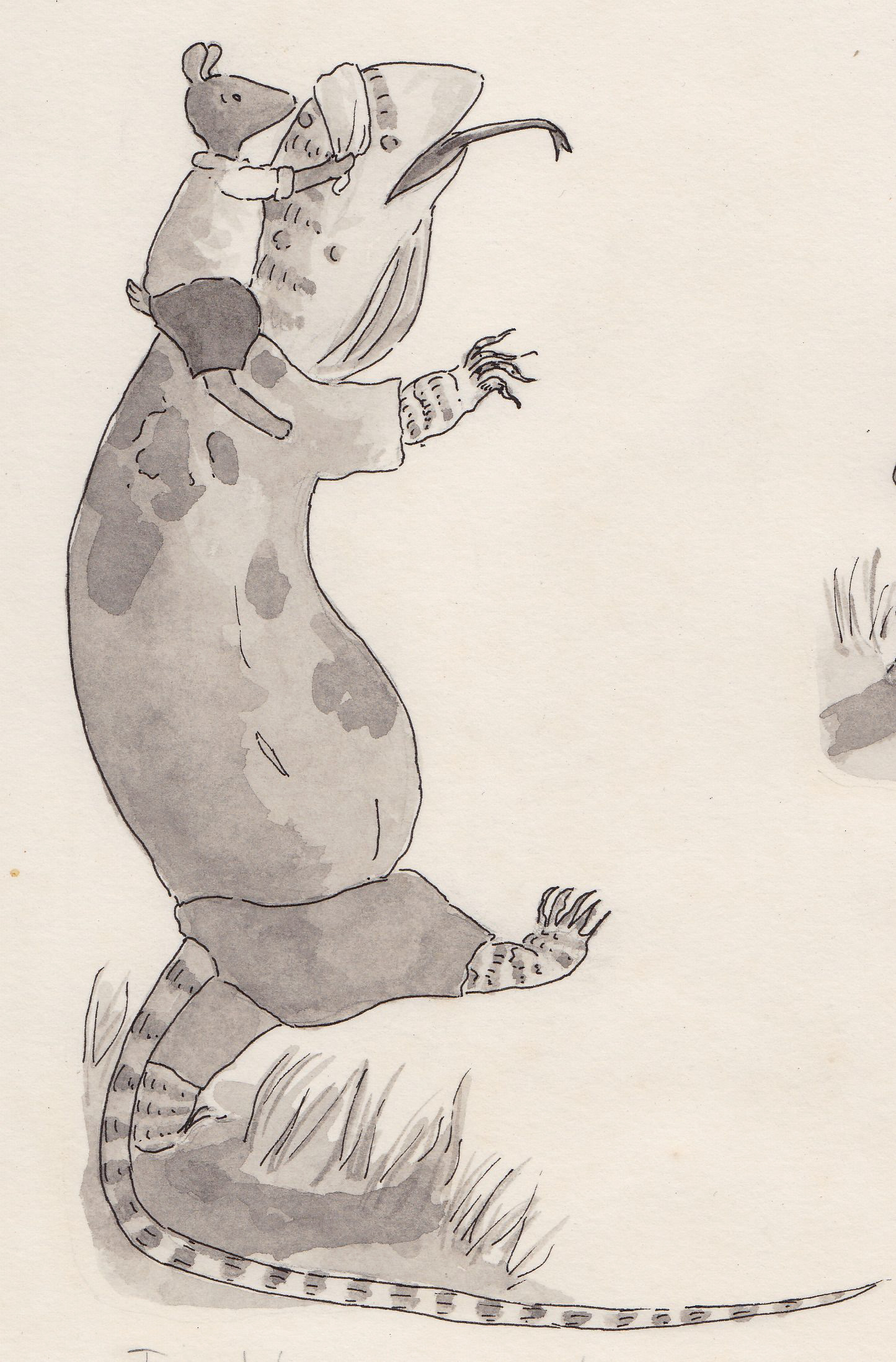
Mr Crust is taken by surprise
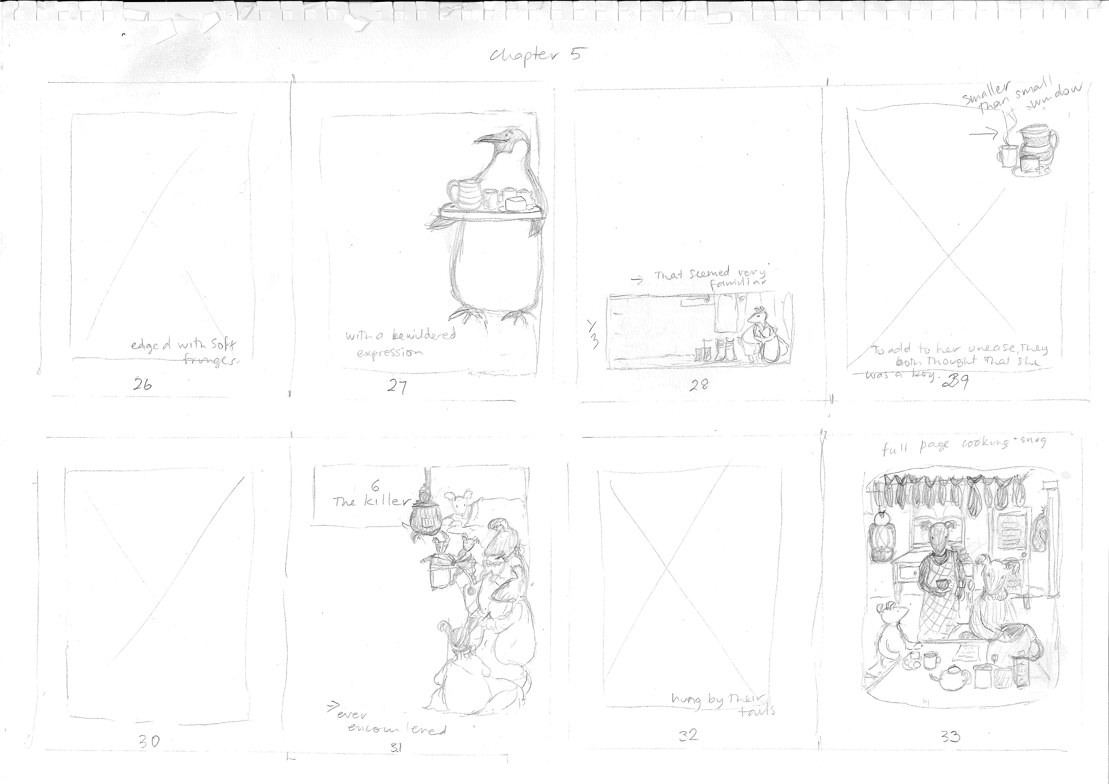
Storyboard roughs for Sea Gem
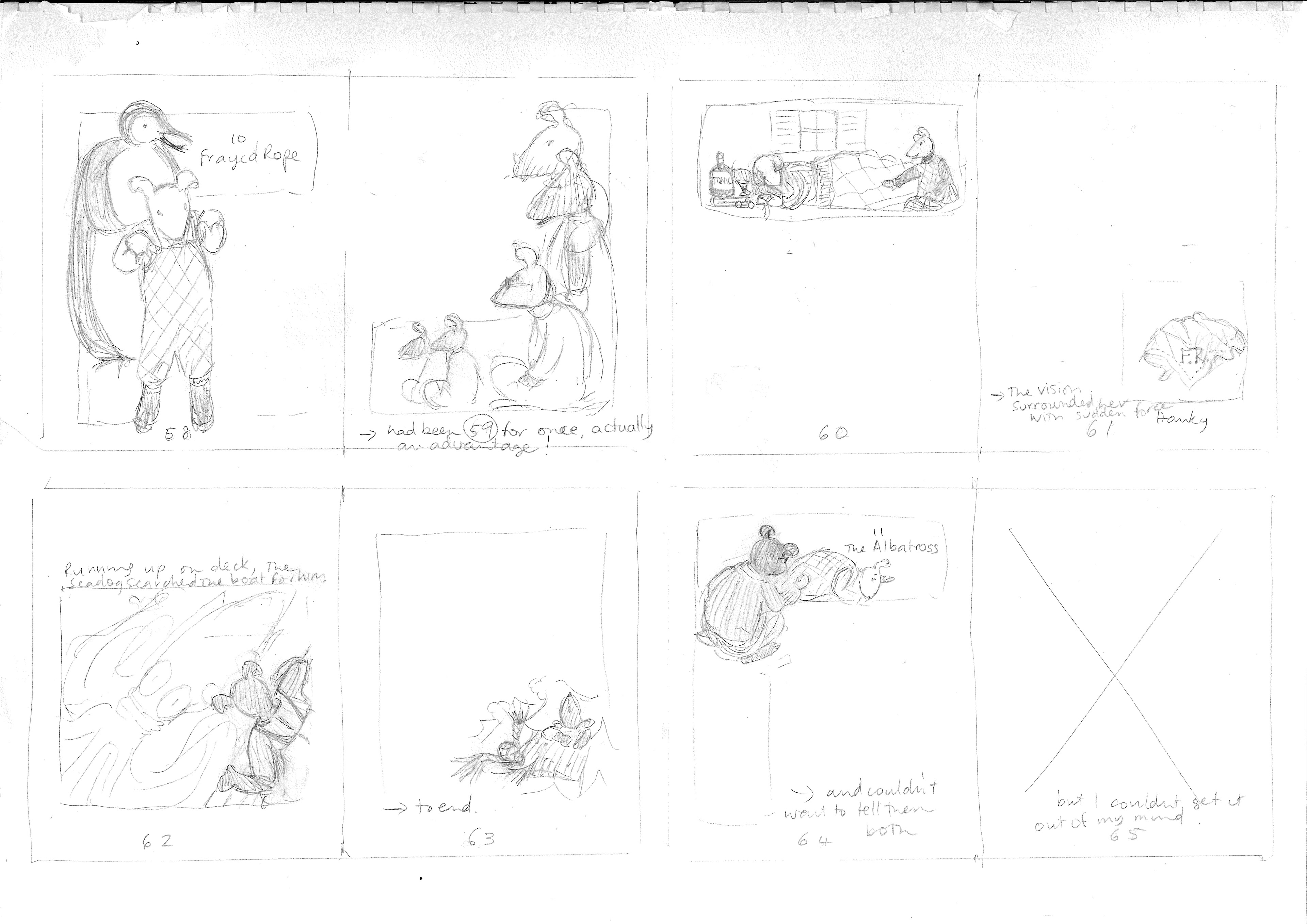
Storyboard roughs for Sea Gem
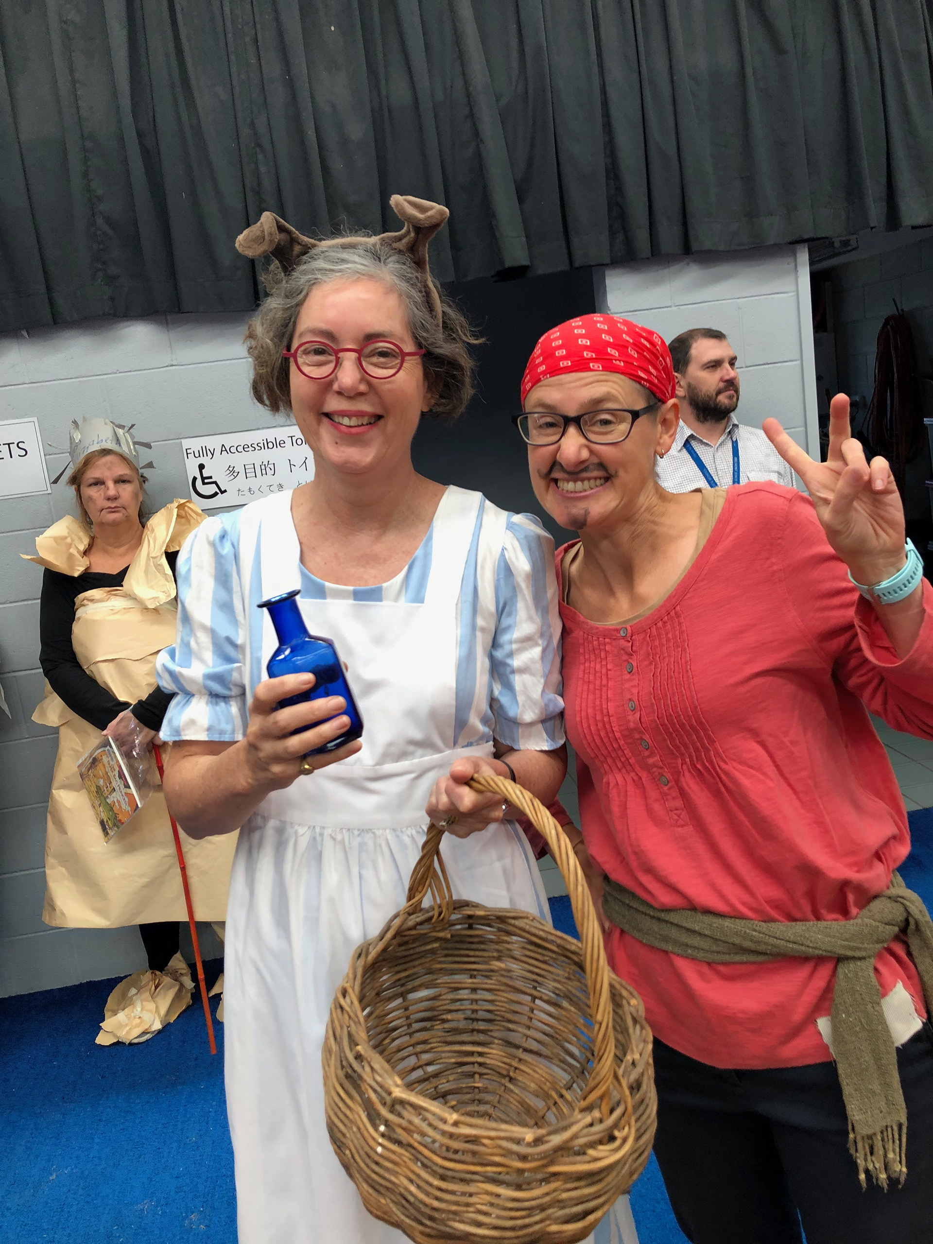
Me dressed as Blue Bottle for a children's book week festival. With Lucia dressed as a pirate
My desk in the kitchen meant I could keep an eye on everything while I was painting. During the day when the kids were at school, I listened to the radio while I worked. When I was writing and meeting deadlines, Stephen would take sometimes the children to the island or go camping for the weekend so I could focus fiercely for the whole two days without interruption. These were precious and very productive hours. However, the kids were no impediment- they very helpful and willing participants. Each day Imogen and Kitty would listen to new chapters when they got home from school. They gave honest feedback with enthusiasm. In fact, they are still helping me- Thomas is now an animator, editor and designer and he helped me to navigate my way around this portfolio.
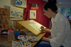
Working at my 'kitchen desk'
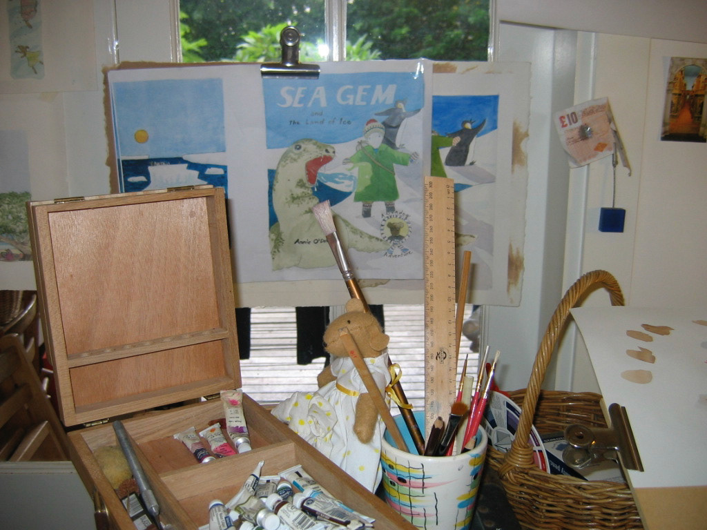
Preparing illustrations for 'Sea Gem and the Land of Ice'
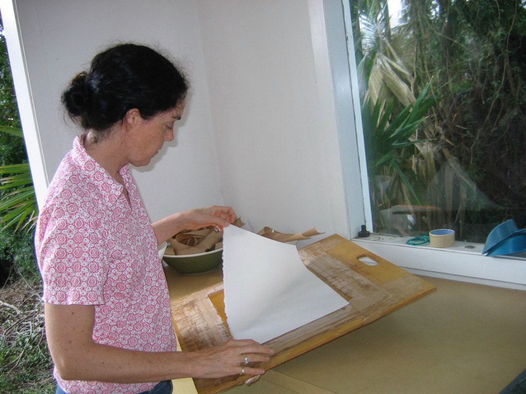
Soaking paper to be stretched
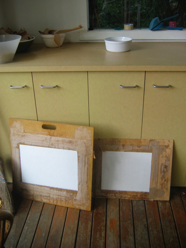
Paper drying
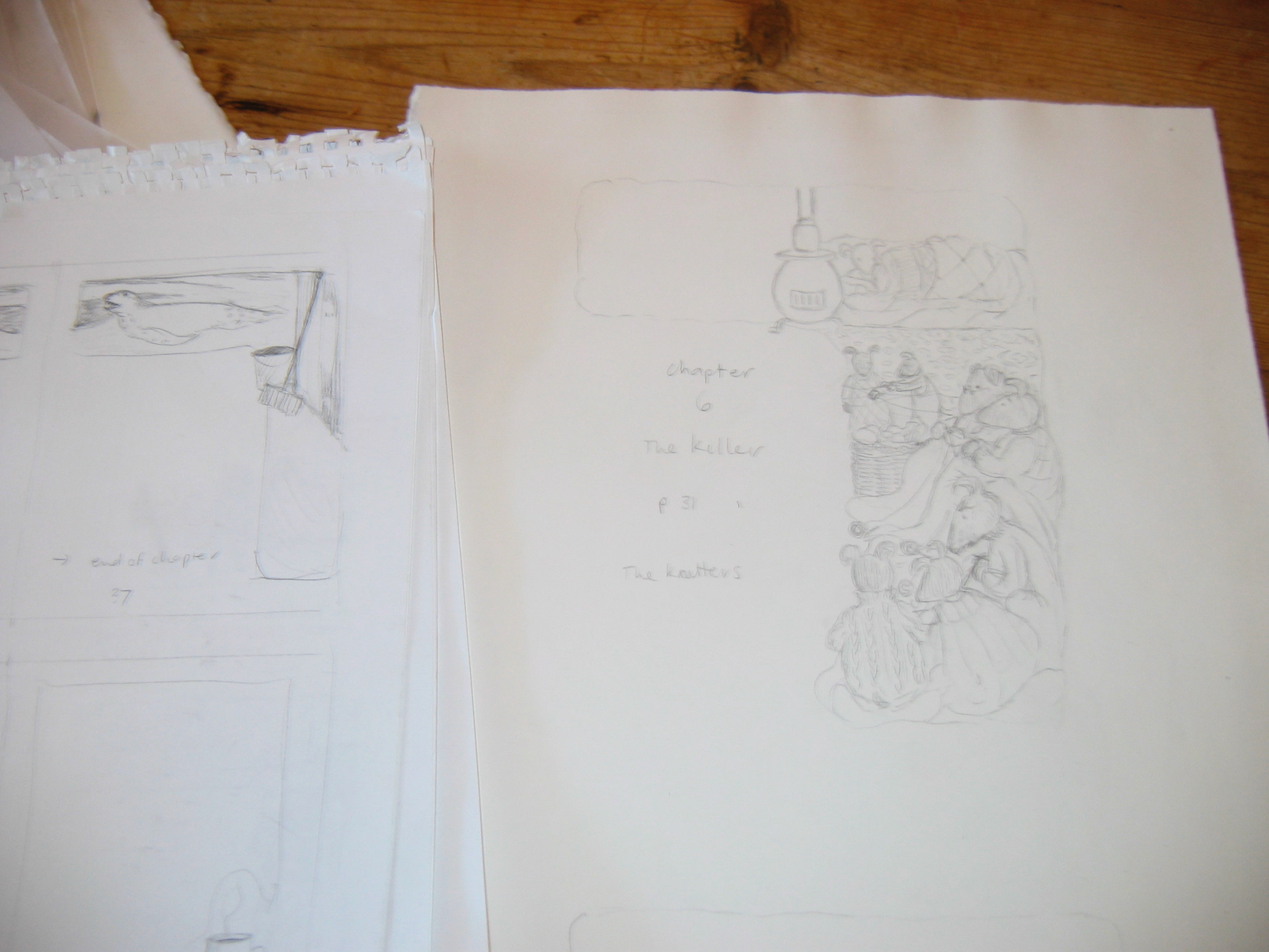
Some pencil beginnings for the Sea Gem illustrations
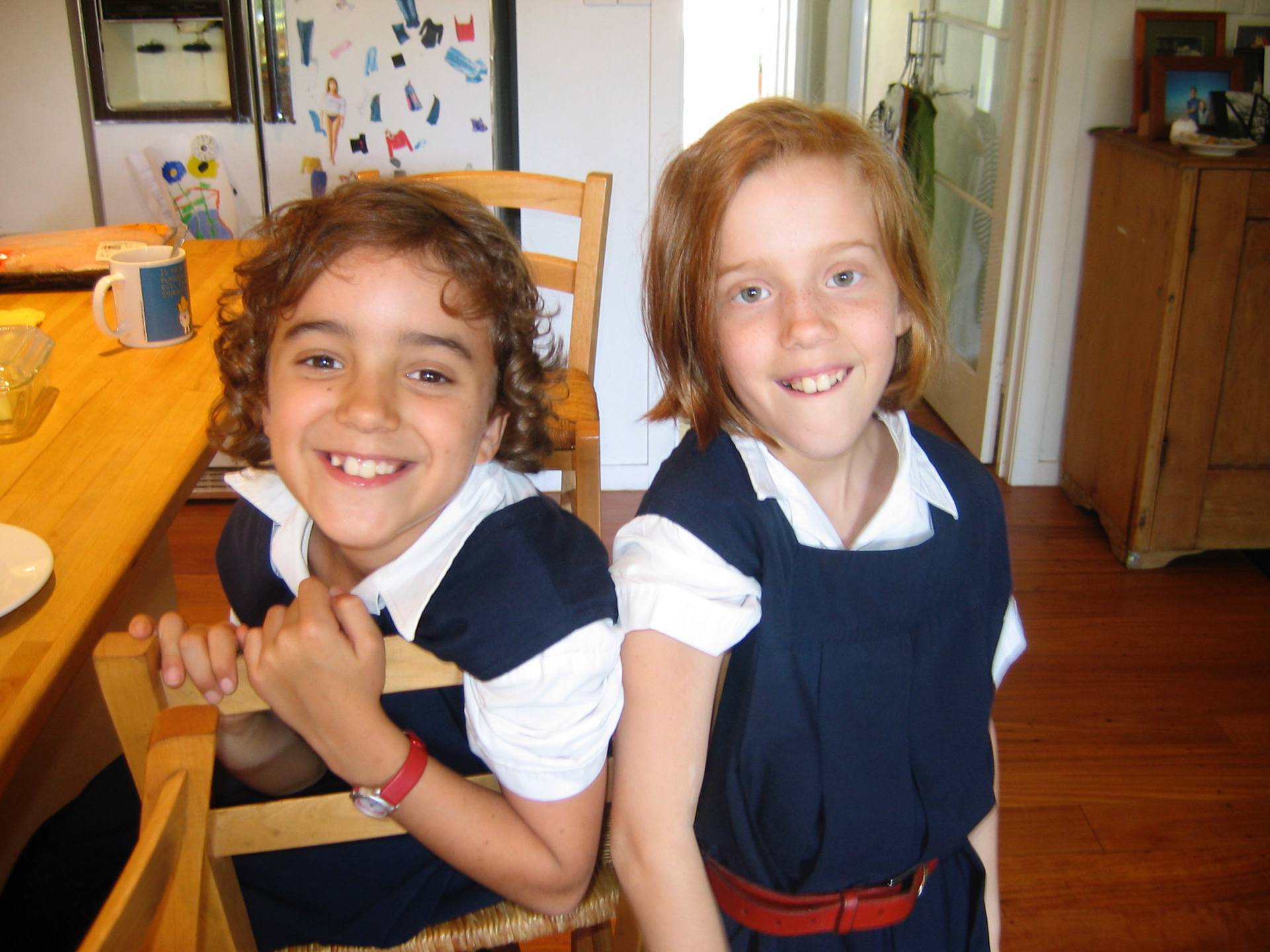
My editors
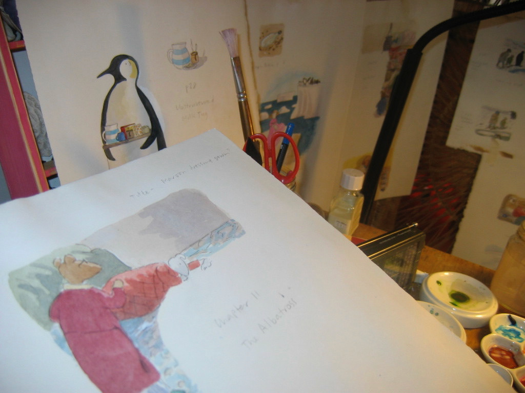
More Sea Gem paintings
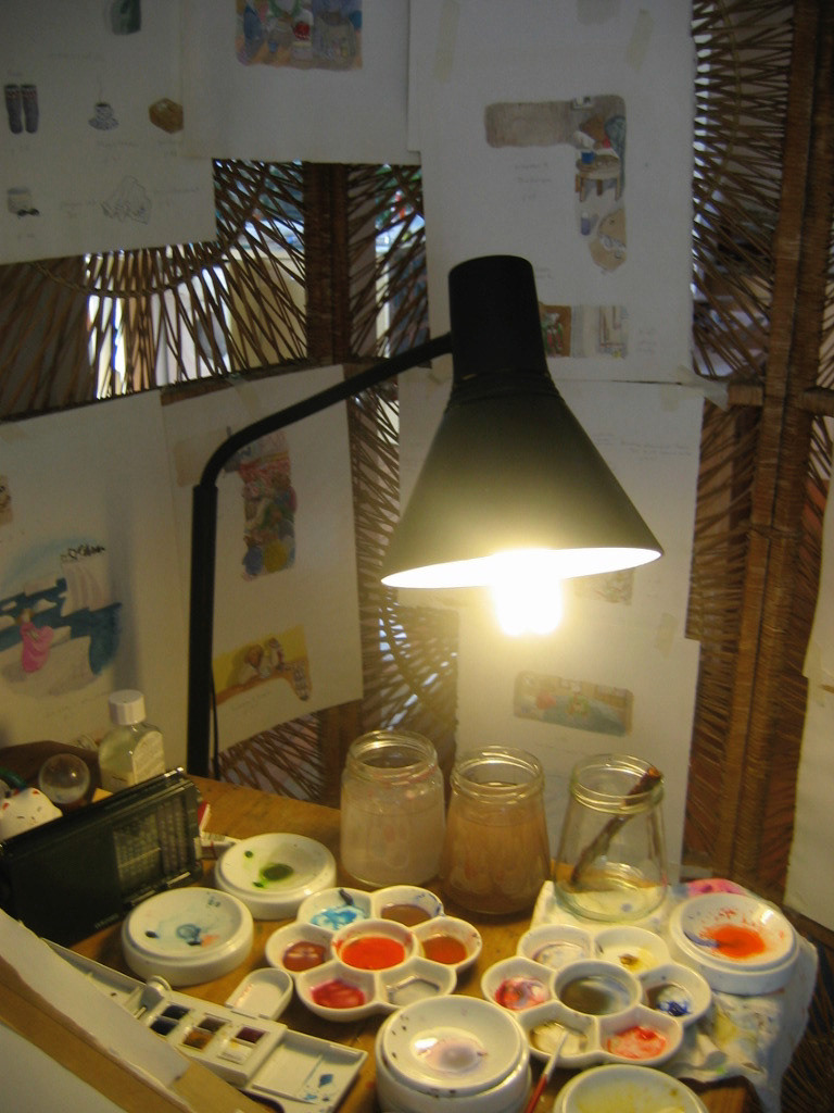
Watercolour palates
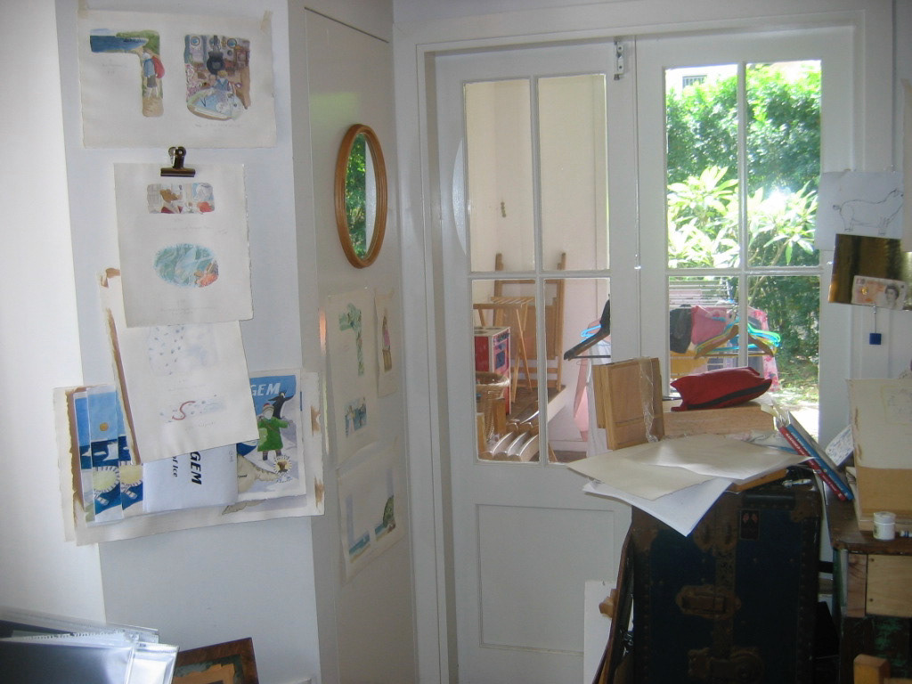
As the visual story unfolds, I tape the paintings to the walls around me so I can see how the story unfolds without the text
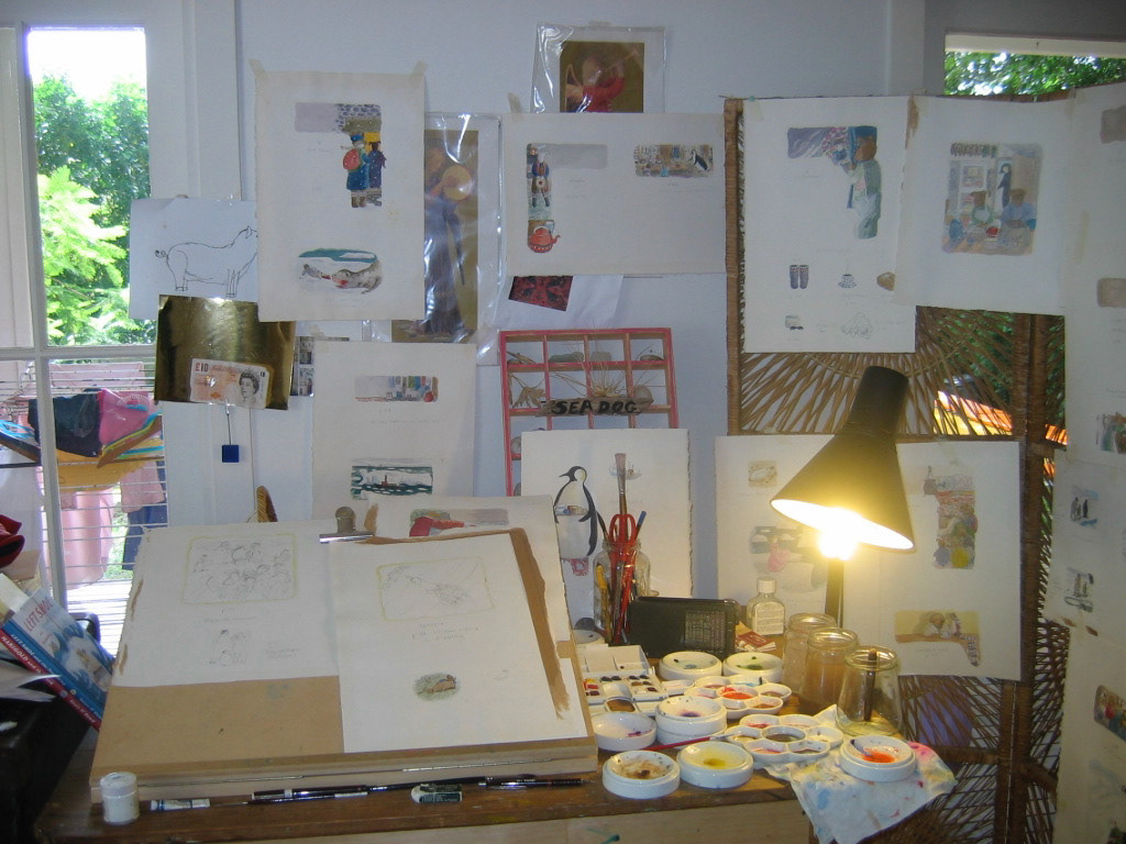
Full production mode
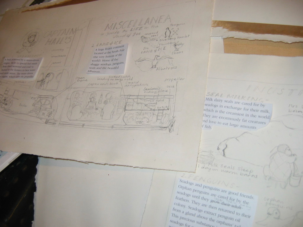
Preparing the appendix for Sea Gem
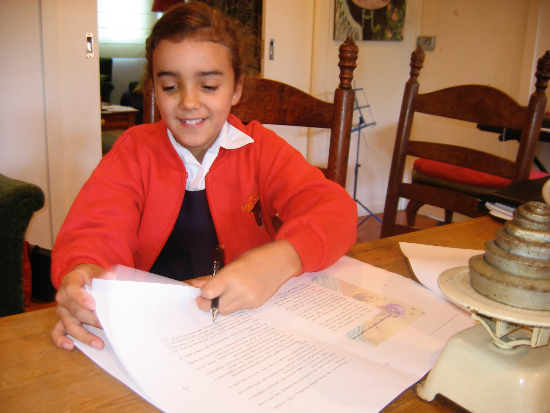
Kitty checking the proofs
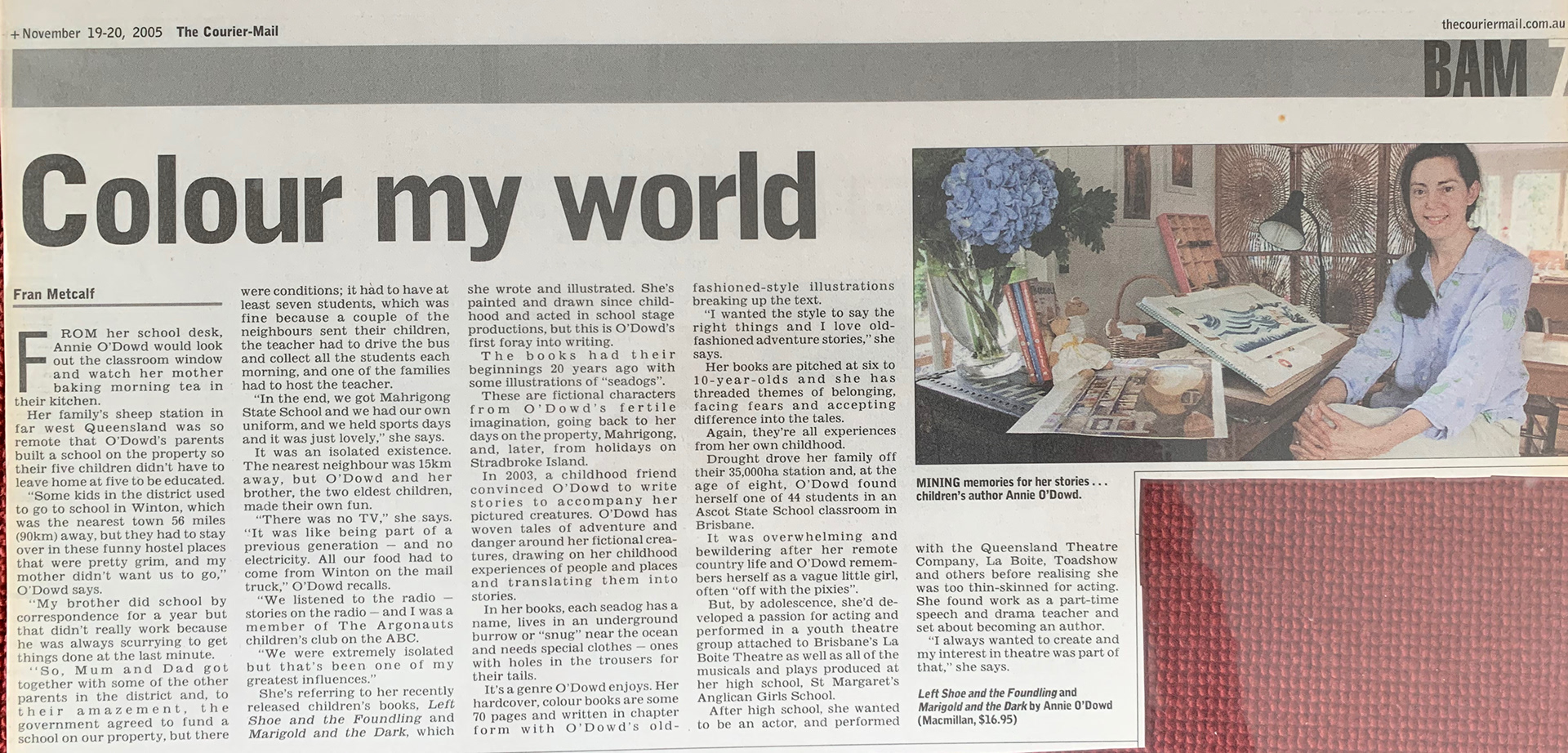
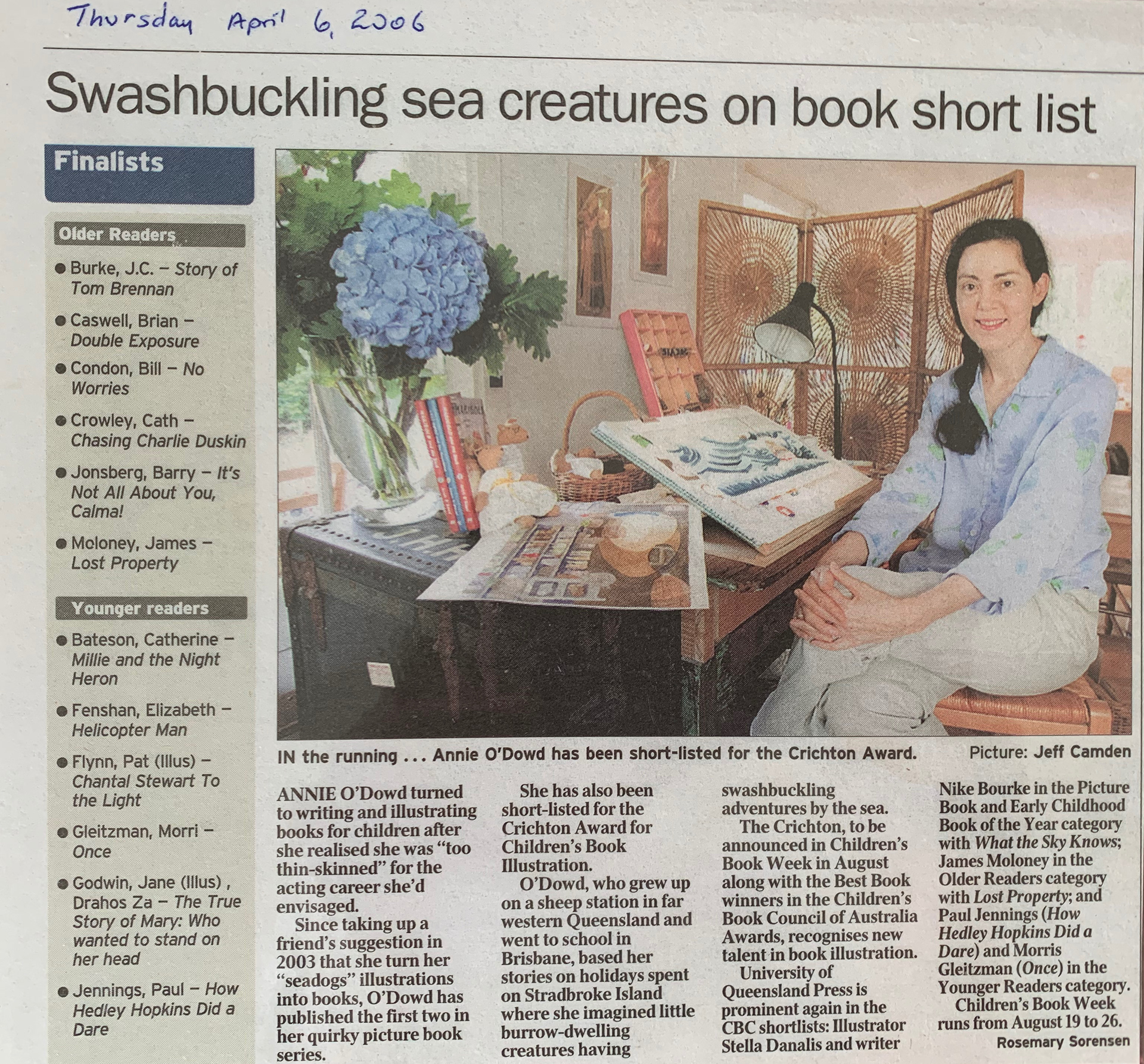
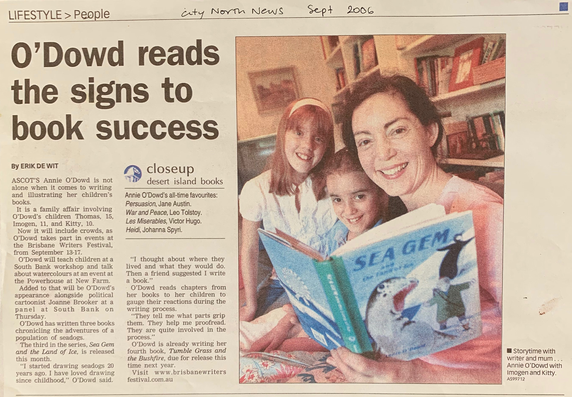
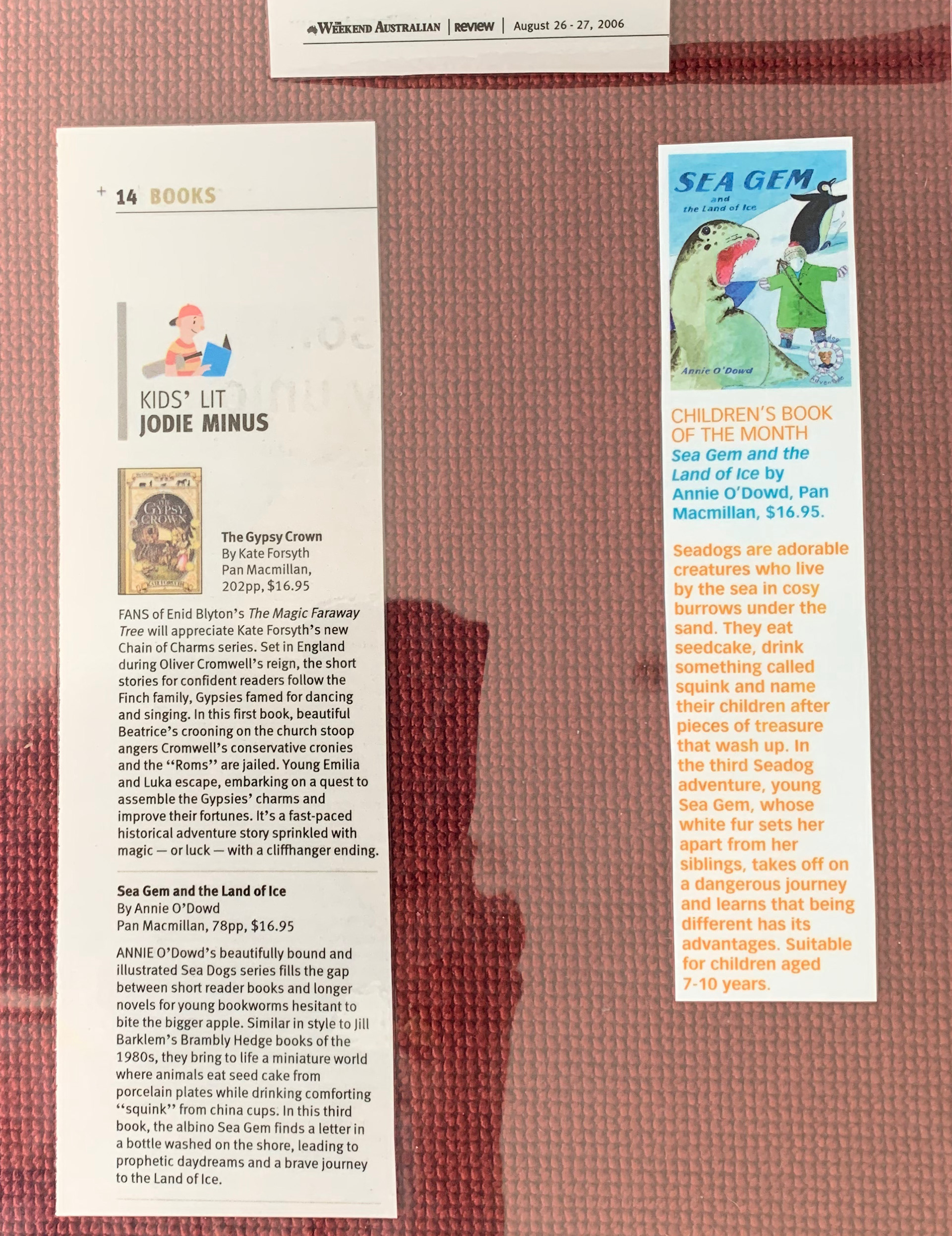
With the publication of the series, press about the books followed. Here are a few examples.
